# A tibble: 1,000 × 3
   ip              new_feature time_spent
   <chr>                 <dbl>      <dbl>
 1 153.168.98.222            0      71.4
 2 119.218.12.199            1      76.1
 3 208.197.60.31             0      68.4
 4 235.143.38.46             1      73.1
 5 86.56.28.141              0      70.4
 6 51.111.112.107            0      45.1
 7 165.165.131.102           0     106.
 8 98.178.26.235             0      14.0
 9 63.223.57.208             0       9.22
10 149.249.67.110            1      79.5
# ℹ 990 more rows3 - Randomized Experiments & Linear Regression
Slides & Recap
Last week, our attention was dedicated to identification with the aid of graphical models. This week, our focus shifts to establishing the connection between causal identification and estimation. This section delves into randomized experiments, widely regarded as the gold standard for causal inference, and linear regression, recognized as the workhorse of causal inference. Randomization is the best way to make treatment and control group comparable, allowing us to go from mere association to causation. Linear regression equips us with the tools to extract statistical information necessary to assess the level of confidence level we have in our estimates.
Effect of introducing a new feature
Let’s jump right into an example of a randomized experiment to grasp the advantages over observational studies. Imagine you’re part of the business analytics team at a software company. Your task is to analyze the impact of introducing a new feature on the time users spend within the app. While the exact nature of this feature isn’t specified, its objective is to boost users’ daily app engagement, thereby driving up ad revenue.
As usual, we need to download and load the data first.
The data contains three columns, ip, new_feature and time_spent. Values in the ip column identify the user, new_feature indicates who has the new feature in the app and time_spent is the average daily minutes a user spent on the app following the start of the randomized experiment.
In the lecture, you learned that when treatment is randomly assigned, potential outcomes are independent of the treatment, and any systematic difference observed in the outcomes can be attributed solely to the treatment. Consequently, we can simply compare the means of the respective groups to estimate the ATE.
\[ \hat{\tau}_{\text{ATE}} = \frac{1}{\sum_i D_i} \sum_i D_i Y_i - \frac{1}{\sum_i (1 - D_i)} \sum_i (1 - D_i) Y_i \] First, we will go through the manual calculation of all we need to estimate the average treatment effect and asses the statistical significance. Afterwards, we will use linear regression, which saves us a lot of work and will be incredibly important in th weeks to come.
Manual calculation
Using the tidyverse allows us a versatile and flexible approach that we can extend later. We group by the treatment column and compute the group-specific means.
Warning: Paket 'ggplot2' wurde unter R Version 4.3.2 erstelltWarning: Paket 'tidyr' wurde unter R Version 4.3.2 erstellt# Grouping by the treatment column and calculating the mean of the outcome
# column by group
group_means <- df |>
group_by(new_feature) |>
summarise(mean_time_spent = mean(time_spent)) |>
ungroup()
# Show group-specific means
print(group_means)# A tibble: 2 × 2
new_feature mean_time_spent
<dbl> <dbl>
1 0 61.0
2 1 63.5To get the difference, we need to add one more step.
# Compute the difference in means
diff(group_means$mean_time_spent)
[1] 2.5Up to this point, this should sound familiar. However, although we have an estimate for the ATE, we lack certainty regarding the confidence in this estimate. We also cannot ascertain whether the difference between the mean outcomes of the treatment and control groups is solely due to chance or holds statistical significance.
Standard deviation and standard error of the mean
In addition to the average, another crucial statistical measure, upon which all subsequent methods of statistical inference rely, is the variance. This measure indicates the extent of dispersion/spread in a random variable. Variance of a random variable \(X\) calculated by:
\[ \sigma_X^2 = \frac{1}{n - 1} \sum_{i=1}^{n} \left(X_i - \frac{1}{n}\sum_{i=1}^{n}X_i\right)^2 \] The standard deviation obtains as the square root of the variance. Unlike the variance it expressed in the same unit as the data.
\[
\sigma = \sqrt{\sigma^2}
\] Let’s add the standard deviation to our summary table. We can use the built-in function sd(). If we would like to compute the variance, we could use var().
# Grouping by the treatment column and calculating the mean and the standard
# deviation of the outcome
# column by group
group_stats <- df |>
  group_by(new_feature) |>
  summarise(
    mean_time_spent = mean(time_spent),
    # add standard deviation
    sd_time_spent = sd(time_spent)
    ) |>
  ungroup()

# Show group-specific statistics
print(group_stats)
# A tibble: 2 × 3
new_feature mean_time_spent sd_time_spent
<dbl> <dbl> <dbl>
1 0 61.0 30.5
2 1 63.5 28.0Knowing the group-specific means and standard deviations brings us one step closer to answer the question whether the treatment effect is large enough to be considered statistically significant. For each group, we also need to know the standard error of the mean. It can be easily confused with the standard deviation, but there is one large difference: the formula for the standard error takes the sample size into account. A larger sample gives us more confidence in the estimate.
Standard deviation measures the dispersion of individual data points from the mean, while standard error of the mean quantifies the precision of the sample mean estimate, reflecting how much the sample mean is likely to vary from the population mean.
\[ SE = \frac{\sigma}{\sqrt n} \] Because there is no built-in function in R, we can easily define a function (we could use external packages, but for the sake of demonstration, we define it ourselves):
In many cases, you will find functions needed for your analysis in base R or by loading external packages. But sometimes, you want to do something so specific, that no one has done it before. Then, you define your custom function by using function(arg1, arg2, ...).
We need to update our table with the statistics by adding the number of observations \(n\) per group (using the function n()) and calculating the standard error of the mean.
# Grouping by the treatment column and calculating the mean, standard deviation,
# sample size, and standard error of the mean
# column by group
group_stats <- df |>
  group_by(new_feature) |>
  summarise(
    mean_time_spent = mean(time_spent),
    # add standard deviation
    sd_time_spent = sd(time_spent),
    # add sample size
    n_obs = n()
    ) |>
  ungroup() |>
  # Add a new column with the standard error of the mean
  mutate(se_time_spent = sd_time_spent / sqrt(n_obs))

# Show group-specific statistics
print(group_stats)
# A tibble: 2 × 5
new_feature mean_time_spent sd_time_spent n_obs se_time_spent
<dbl> <dbl> <dbl> <int> <dbl>
1 0 61.0 30.5 590 1.26
2 1 63.5 28.0 410 1.38Confidence interval
A profoundly useful mathematical theorem is the Central Limit Theorem, which states that the distribution of sample means tends towards normality. Understanding the mean and standard error of the mean equips us with all the necessary information to comprehend and illustrate the distribution.
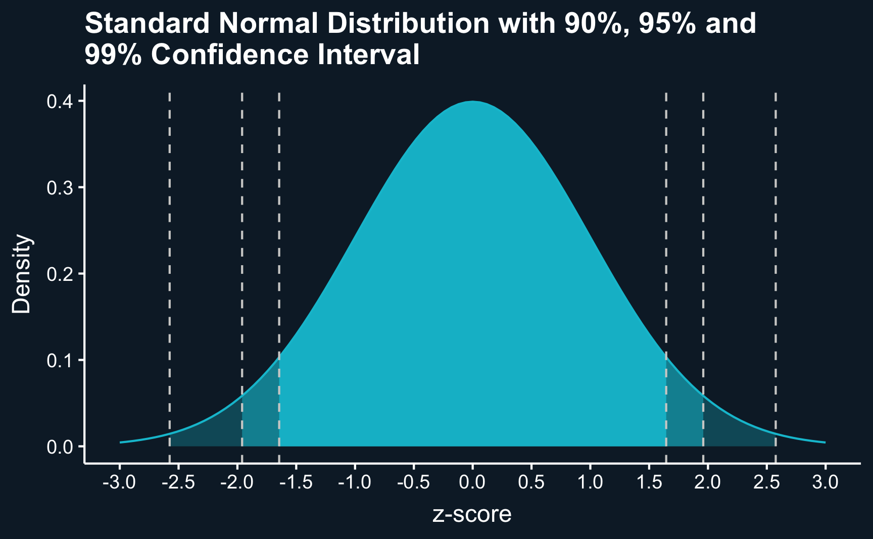
Here, we plot the standard normal distribution, characterized by a mean of zero and a standard deviation of one. By delineating the mass of the distribution limited by specific values, we can construct confidence intervals around our estimates. These intervals provide a range within which the true mean likely lies, with a chosen probability. While 95% confidence intervals are most commonly reported, values such as 90% or 99% are also frequently used For instance, approximately 95% of the area under the normal distribution falls within approximately two standard deviations below and above the mean.
Code
ggplot(data.frame(x = c(-3, 3)), aes(x)) +
  stat_function(fun = dnorm,
                geom = "line",
                xlim = c(-3, 3)) +
  stat_function(fun = dnorm,
                geom = "area",
                fill = ggthemr::swatch()[2],
                alpha = .3,
                xlim = c(qnorm(.005), qnorm(.995))) +
  stat_function(fun = dnorm,
                geom = "area",
                fill = ggthemr::swatch()[2],
                alpha = .5,
                xlim = c(qnorm(.025), qnorm(.975))) +
  stat_function(fun = dnorm,
                geom = "area",
                fill = ggthemr::swatch()[2],
                alpha = .9,
                xlim = c(qnorm(.05), qnorm(.95))) +
  scale_x_continuous(limits = c(-3, 3), breaks = seq(-3, 3, .5)) +
  geom_vline(xintercept = qnorm(.005), linetype = "dashed", color = ggthemr::swatch()[1]) +
  geom_vline(xintercept = qnorm(.995), linetype = "dashed", color = ggthemr::swatch()[1]) +
  geom_vline(xintercept = qnorm(.025), linetype = "dashed", color = ggthemr::swatch()[1]) +
  geom_vline(xintercept = qnorm(.975), linetype = "dashed", color = ggthemr::swatch()[1]) +
  geom_vline(xintercept = qnorm(.05), linetype = "dashed", color = ggthemr::swatch()[1]) +
  geom_vline(xintercept = qnorm(.95), linetype = "dashed", color = ggthemr::swatch()[1]) +
  theme(panel.grid = element_blank()) +
  ggtitle("Standard Normal Distribution with 90%, 95% and \n99% Confidence Interval") +
  labs(x = "z-score", y = "Density")
We can use this directly to compute the confidence intervals around our estimated group means. For the 95% confidence interval, we have \(alpha = 1 - 0.95 = 0.05\) and can get z-value using using qnorm(.975)
\[ \hat{\mu} \pm z_{\alpha/2} * SE \]
Confidence level and significance level are sometimes confused.
- confidence level = 1- significance level = 95%
- significance level (or alpha) = 1 - confidence level = 5%
Adding the confidence intervals to our table:
# Grouping by the treatment column and calculating the mean, standard deviation,
# sample size, and standard error of the mean
# column by group
group_stats <- df |>
  group_by(new_feature) |>
  summarise(
    mean_time_spent = mean(time_spent),
    # add standard deviation
    sd_time_spent = sd(time_spent),
    # add sample size
    n_obs = n()
    ) |>
  ungroup() |>
  # Add a new column with the standard error of the mean
  mutate(
    se_time_spent = sd_time_spent / sqrt(n_obs),
    # adding confidence intervals (lower and upper bound)
    ci_lb = mean_time_spent - qnorm(.975) * se_time_spent,
    ci_ub = mean_time_spent + qnorm(.975) * se_time_spent
    )

# Show group-specific statistics
print(group_stats)
# A tibble: 2 × 7
new_feature mean_time_spent sd_time_spent n_obs se_time_spent ci_lb ci_ub
<dbl> <dbl> <dbl> <int> <dbl> <dbl> <dbl>
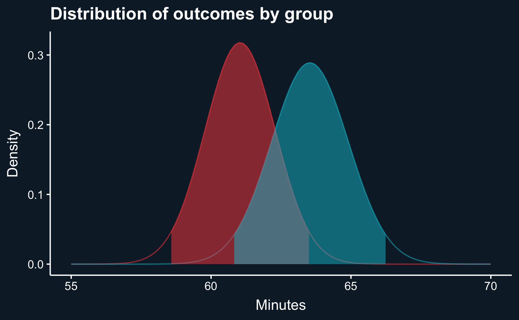
1 0 61.0 30.5 590 1.26 58.6 63.5
2 1 63.5 28.0 410 1.38 60.8 66.2Comparing the confidence intervals across the groups, we see some overlap. However, that does not yet mean that they are not statistically significant, although it is usually a good indication. And, in fact, if they did not overlap at all, you would be able to conclude that they are statistcally different.
Code
u0 <- group_stats[group_stats$new_feature == 0, ]$mean_time_spent
u1 <- group_stats[group_stats$new_feature == 1, ]$mean_time_spent

o0 <- group_stats[group_stats$new_feature == 0, ]$se_time_spent
o1 <- group_stats[group_stats$new_feature == 1, ]$se_time_spent

ci_lb0 <- group_stats[group_stats$new_feature == 0, ]$ci_lb
ci_lb1 <- group_stats[group_stats$new_feature == 1, ]$ci_lb

ci_ub0 <- group_stats[group_stats$new_feature == 0, ]$ci_ub
ci_ub1 <- group_stats[group_stats$new_feature == 1, ]$ci_ub


ggplot(data.frame(x = c(55, 70)), aes(x)) +
  stat_function(fun = dnorm,
                color = ggthemr::swatch()[3],
                alpha = .5,
                args = list(mean = u0, sd = o0),
                geom = "line") +
    stat_function(fun = dnorm,
                color = ggthemr::swatch()[2],
                alpha = .5,
                args = list(mean = u1, sd = o1),
                geom = "line") +
  stat_function(fun = dnorm,
                fill = ggthemr::swatch()[3],
                alpha = .5,
                args = list(mean = u0, sd = o0),
                geom = "area",
                xlim = c(ci_lb0, ci_ub0)) +
  stat_function(fun = dnorm,
                fill = ggthemr::swatch()[2],
                alpha = .5,
                args = list(mean = u1, sd = o1),
                geom = "area",
                xlim = c(ci_lb1, ci_ub1)) +
  ggtitle("Distribution of outcomes by group") +
  labs(x = "Minutes", y = "Density") +
  theme(panel.grid = element_blank())
Hypothesis testing
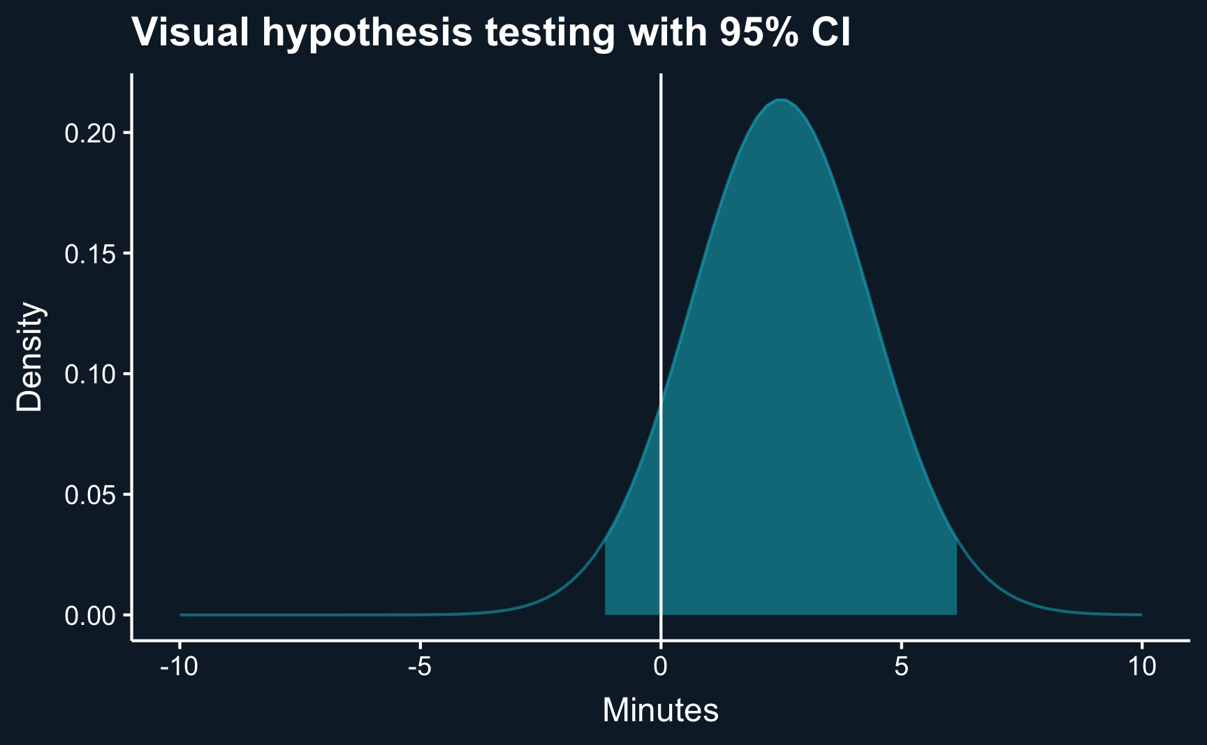
To comprehensively address the question, “Is the difference statistically significant from zero (or any other value)?” we rely on hypothesis testing. Leveraging the mathematical principle that the sum or difference of two independent normal distributions also follows a normal distribution, we can check whether the confidence interval of the ATE contains zero. This occurs because the ATE is derived as the difference between the distributions of the two groups.
Let’s explicitly formulate what we test:
\(H_0: \mu_1 - \mu_0 = 0\)
Expressed in formulas, the mean of the resulting normal distribution is
\[ \mu_{diff} = \mu_1 - \mu_0 \]
and the standard deviation is (please note, that it is the sum and not the difference)
\[ SE_{diff} = \sqrt{SE_1^2 + SE_0^2}. \]
# Get means
mu_0 <- group_stats[group_stats$new_feature==0, ]$mean_time_spent
mu_1 <- group_stats[group_stats$new_feature==1, ]$mean_time_spent

# Get standard errors
se_0 <- group_stats[group_stats$new_feature==0, ]$se_time_spent
se_1 <- group_stats[group_stats$new_feature==1, ]$se_time_spent
# Mean
diff_mu <- mu_1 - mu_0
diff_mu[1] 2.5# Standard error
diff_se <- sqrt(se_1^2 + se_0^2)
diff_se[1] 1.9Let’s make another plot: the distribution of the difference. We can already do the visual hypothesis test.
Code
ggplot(data.frame(x = c(-10, 10)), aes(x)) +
  stat_function(fun = dnorm,
                alpha = .5,
                args = list(mean = diff_mu, sd = diff_se),
                geom = "line") +
  stat_function(fun = dnorm,
                alpha = .5,
                args = list(mean = diff_mu, sd = diff_se),
                geom = "area",
                xlim = c(diff_mu - qnorm(.975) * diff_se, diff_mu + qnorm(.975) * diff_se)) +
  geom_vline(xintercept = 0, color = "white") +
  ggtitle("Visual hypothesis testing with 95% CI") +
  labs(x = "Minutes", y = "Density") +
  theme(panel.grid = element_blank())
What we can infer from the plot already, can be confirmed by computing the confidence intervals with the known formula.
diff_ci_lb = diff_mu - qnorm(.975) * diff_se
diff_ci_ub = diff_mu + qnorm(.975) * diff_se

print(c("Lower CI" = diff_ci_lb, "Upper CI" = diff_ci_ub))
Lower CI Upper CI
-1.2 6.2 Null hypothesis: the null hypothesis \(H_0\) is the claim the the effect being studied does not exists. The effect is a “null” effect.
Question: Do we reject the null hypothesis?
Answer
No. The ATE is not different from zero.
[Optional read] p-value
From a slightly different perspective, we can also compute the p-value to tell us the confidence in our estimates. The question we ask is then: What is the lowest significance level that results in rejecting the null hypothesis?
First, we need to compute the t-statistic:
\[ \begin{align} t_{ATE} = \frac{\mu_1 - \mu_0}{\sqrt{SE_1^2 + SE_0^2}} &= \frac{\mu_{diff}}{SE_{diff}} \end{align} \]
t_stat = (diff_mu - 0) / diff_seKnowing the t-statistic, we provide it in to the following command.
(1 - pnorm(t_stat)) * 2[1] 0.18pnorm(q) returns the integral from \(-\infty\) to \(q\), i.e. the mass up to the value \(q\). Because we are using the two-sided test, we need to multiply by 2.
The p-value expresses the probability with which the null hypothesis is correct. For a rigorous statistical analysis, you usually expect a value of lower than 5% (sometimes 10% or 1%). Please note that this is just a different perspective and the common levels for p-values directly derive from the common values for confidence intervals.
Linear regression
All the steps required to assess the hypothesis regarding the statistical significance of the average treatment effect can be condensed into a single step: running a linear regression. Regression functions as the workhorse for causal inference, serving as the cornerstone for more advanced techniques. Through the simple command lm(), regression seamlessly provides all the necessary statistical output for our analysis. Furthermore, it allows the implementation of more complex analyses beyond single-value treatments with ease.
The generic functional form of a singe-valued regression without any covariate is as follows. \(Y\) is the outcome variable, \(D\) is treatment variable, and \(e\) is the error term. We are interested in estimating the coefficients denoted by \(\beta\), particularly \(\beta_1\), which is the treatment effect.
\[ Y_i = \beta_0 + \beta_1*D+e_i \]
We’ve already encountered the syntax before, but if you do not recall: y ~ x, where \(y\) is the outcome and \(x\) the explaining variable. We specify the respective variables in our data: we want to explain the effect of new_feature on time_spent, fit the model using lm() and assign it to a variable. Then, for a good summary of the estimates and statistical measures, we apply the summary() function to the fitted object.
Call:
lm(formula = time_spent ~ new_feature, data = df)

Residuals:
   Min     1Q Median     3Q    Max
-63.53 -19.83   1.11  19.08  96.01

Coefficients:
            Estimate Std. Error t value Pr(>|t|)
(Intercept)    61.04       1.21   50.30   <2e-16 ***
new_feature     2.49       1.90    1.32     0.19
---
Signif. codes:  0 '***' 0.001 '**' 0.01 '*' 0.05 '.' 0.1 ' ' 1

Residual standard error: 30 on 998 degrees of freedom
Multiple R-squared:  0.00173,   Adjusted R-squared:  0.000732
F-statistic: 1.73 on 1 and 998 DF,  p-value: 0.188
Take a look at the output and try to find the statistical measures we have manually calculated before.
- Group means
- Treatment effect
- Standard error of the estimates
- Confidence interval
- Hypothesis testing
The output contains a p-value but does not contain confidence intervals because it is agnostic to the confidence level. However, if you are interested in confidence intervals for a specific confidence level, you can use the confint(model, level) function to calculate them. Or just simply calculate them by hand as you have learned.
confint(lr, level = .95) 2.5 % 97.5 %
(Intercept) 58.7 63.4
new_feature -1.2 6.2Although the average treatment effect is equal, a minor difference in the statistics may arise. This difference stems from approximating the t-distribution with the normal distribution, a common practice when dealing with more than 100 observations. The benefit of utilizing the normal distribution is not needing to specify the degrees of freedom (sample size minus estimated parameters).
A/B test at streaming service
Consider the following scenario: you are a data scientist at a music streaming company. Naturally, you’re keen to engage users for as long as possible and encourage them to become avid users of your streaming app. Your colleagues from the department responsible for recommendation algorithms have developed a new fancy algorithm which aims to enhance the daily number of minutes of music listening by offering particularly well tailored recommendations. Following common practice of A/B testing, you randomly assign your users into a treatment group (new algorithm) and a control group (no new algorithm). Download the data here.
As a pre-check, test whether your random assignment worked well by comparing the daily number of minutes users listened to music per group.
Compute the average treatment effect using a linear regression.
-
Take a look at the summary statistics of the regression and answer the following questions:
What is the estimated treatment effect?
What is the null hypothesis and do you reject or do you confirm it? At what significance level?
What doest \(R^2\) describe?
What is the intercept and what does it describe?
Calculate 90%, 95% and 99% confidence intervals for the treatment effect and compare them. Which intervals are larger? And what question do they answer?
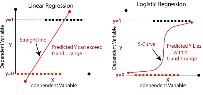
After one month, you are asked to take a different outcome into focus - the rate of subscription cancellations. For each user you find the information whether he/she cancelled his/her subscription in the column cancel: 1 if cancelled, and 0 if not. Because other than minutes, cancel is a binary variable (it can only be 0 or 1), you need to apply a different form of regression: the logistic regression. There is lot of theory behind it, which we will not cover now. But feel free to read here about it.
However, what you need to understand when using logistic regression is that the interpretation of the coefficients changes because you are acutally fitting
\[ logit(P(Y=1)) = logit(p) = log(\frac{p}{1-p}) = \beta_0 + \beta_1*D + \epsilon, \]
which is different from the linear regression. We know relate a one-unit increase in \(D\) (treated or not-treated) with an increase in \(logit(p)\). Therefore, you can read the coefficient as follows:
Increasing \(D\) by 1 will result in a \(\beta_1\) increase in \(logit(p)\), which is approximately an \((exp(\beta_1)-1)\) % increase in the odds \(\frac{p}{1-p}\).
Instead of lm() use the following command: glm(formula, family=binomial(link='logit'), data), where you replace formula with the known syntax.
Fit the model and return the summary statistics.
Interpret the coefficients.
Find here the solutions.
Assignment
Accept the Week 3 - Assignment and follow the same steps as last week and as described in the organization chapter.
Imagine that there are cost associated with providing each user with this new algorithm. Your business colleague tells you, that from a business perspective, the introduction is only beneficial if users listen at least 5% more than before. Develop a hypothesis based on this information and test it.
One advantage of A/B testing in software companies is the ability to monitor the experiment simultaneously. For the first three days after having started the experiment you check the numbers and compute the ATE. Simulate this by subsetting the data to include observations available after the first day, after the second day and after the third day. Do you notice any differences? If yes, what could be a possible explanation? Run the analysis for both outcomes,
minutesandcancel. (Hint: you need to use the variablelog_in_daywhich tells you at what day the users first logged in after the start of the experiment. Before that, we could not observe their behavior.)Compute conditional ATEs based on the day the users first logged into the application. (Please note, this is different to 2.) There are two different ways to compute the CATEs: you could subset the data and run the analysis for each condition or you could add a so-called interaction effect to your regression syntax by
y ~ x + x:interaction, where interaction is the variable you to affect the treatment effect. Run the analysis for both outcomes,minutesandcancel.Your colleagues responsible for the development of the recommendation algorithm tell you that they ran an experiment prior to your experiment with a small number of Beta users. These users signed up to test a Beta version of your app where new features are tested before being released. Because your colleague received different results than you, he prefers to stick to his/her own estimates. Convince your colleague that your experiment returns more valid estimates. Use a DAG to do so.


