# Read data. You probably have to add the correct path
df <- readRDS("coupon.rds")

# Define cut-off
c0 <- 60Regression Discontinuity
Introduction
The next tool we introduce is called regression discontinuity design (RDD). Fist used in 1960 (Campbell), it did not play a large role until 1999 and since then has experienced growing acceptance due to the advance of more rigorous requirements regarding credibility and causality in social sciences. Another factor that made many researchers use RDDs is the increased availability of digitized administrative data that is often linked to arbitrary rules that can be exploited to capture “as-if” randomization processes for treatment assignment.
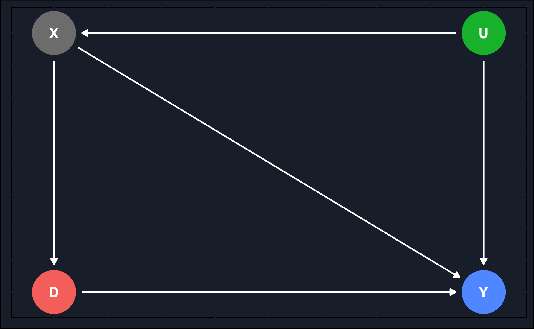
Assuming a data-generating process, where we have a variable \(X\) that is a confounder as it has an impact on treatment assignment \(D\) and the outcome \(Y\). Additionally, we could have an unobserved confounders between \(X\) and \(Y\).
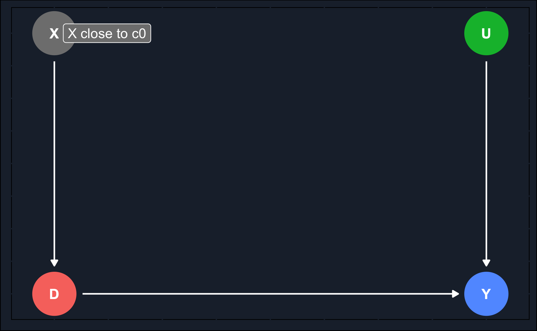
Then, as can be seen in the second DAG, the regression discontinuity design exploits the fact that \(X\) determines \(D\) and data is filtered such that there are only observations that were close to a cut-off value determining their treatment status. This way, treated and untreated units are very similar and comparable and RDD is able to eliminate selection bias for that sub-population. Note that the treatment effect you calculate using this method is an average treatment effect for a subgroup rather than for the whole population. Like with IV, it is the local average treatment effect (\(LATE\)).
\(X\) is called the running variable and is a continuous variable assigning units to treatment \(D\) based on a cut-off score \(c_0\). Because it has an impact on \(Y\) as well, it is a confounder and opens a backdoor path. Now, the problem is that due to the cut-off determining the treatment \(D\), the backdoor cannot be closed with regular ways like e.g. matching as there is no overlap, i.e. there are no treated and untreated units for all levels of \(X\).
- Running/forcing variable: variable that determines or strongly influences treatment assignment.
- Cut-off/threshold: rule-based value that divides units into treatment an control group.
Therefore, as the second graph shows, the causal effect is identified by analyzing only observations that are in close neighborhood to \(c_0\). The identified treatment effect is the local average treatment effect (LATE).
\[ LATE_{RDD} = E[Y_1 - Y_0| X \rightarrow c_0] \]
Continuity assumption
RDD relies heavily on the continuity assumption, which implies that the cut-off value is exogenous, i.e. there is no logic why the cut-off has to be at that particular level of \(X\). In other words, the rule was chosen arbitrary. Only if that is fulfilled, expected potential outcomes are almost the same for units just below and just above the cut-off (the only units that are analyzed). Across the cut-off threshold, both \(E[Y_0|X \rightarrow c_0]\) and \(E[Y_1|X \rightarrow c_0]\) are continuous functions of \(X\).
Smooth and continuous functions of potential outcomes at the cut-off also implies that there are no other interventions or variables that occur at the cut-off and rules out omitted variable bias.
Graphically, we have illustrated the continuity assumption by removing the arrow from \(X\) to \(Y\). As all units have about the same value for \(X\), no effect from \(X\) on \(Y\) can be expected from those specific units. For \(X \rightarrow c_0\), there is no direct effect from \(X\) to \(Y\).
There are two different designs of RDD. Both have in common that the probability of treatment changes discontinuously at the threshold, but how strict the probability changes differs.
- Sharp design: at the cut-off, probability changes from \(0\) to \(1\). All units below cut-off belong to control group, while all units above cut-off belong to treatment group (or the other way around).
- Fuzzy design: at the cut-off, probability discontinuously increases. Most units below cut-off belong to control group, while most units above cut-off belong to control group (or the other way around). Here, cut-off is used as an instrumental variable.
Ensuring the fulfillment of the continuity assumption is essential when conducting a valid regression discontinuity design (RDD).
Violations can potentially happen when:
- units/individuals know assignment rule in advance
- units/individuals are interested in adjusting behavior according to assignment rule
- units/individuals have enough time to adjust
- other factors cause potential outcomes to shift at cut-off
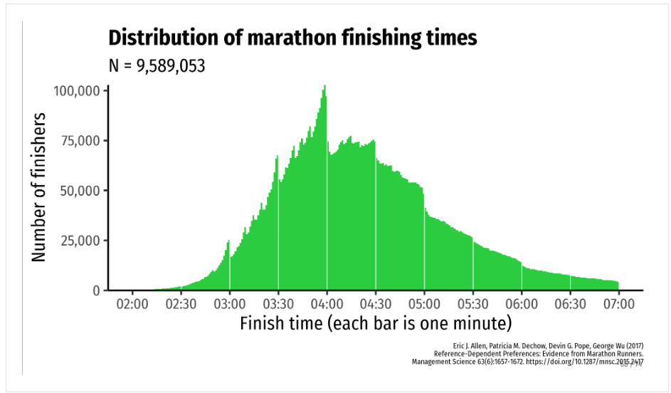
- units/individuals heap non-randomly along running variable
Application
Identification Strategy
RDDs are quite intuitive and very graphical. For this reason, we will go through estimation and inference using an application and explain at each step what has to be considered.
In our application we want to study how sending coupons to customers influences their purchasing behavior. We could run a randomized controlled trial and only send a coupon to a random selection. However, let’s imagine we have already conducted another campaign without randomization and want to exploit the results. Last year 5€ coupons were sent to customers who had not bought within the previous 60 days.
That is an arbitrary cut-off rule that we have discussed in the introduction. We can exploit it because we have customers around the cut-off that should be very similar. However, we could not convincingly argue that customers that had bought within the last few days are similar to those who have bought for example more than three months before.
Thus, our cut-off value is \(c_0 = 60\).
Let’s have a look at what the data looks like. We know when the customers bought the last time and based on that received a coupon or did not receive anything and we know the purchases they made after the coupon distribution.
# Show data
df
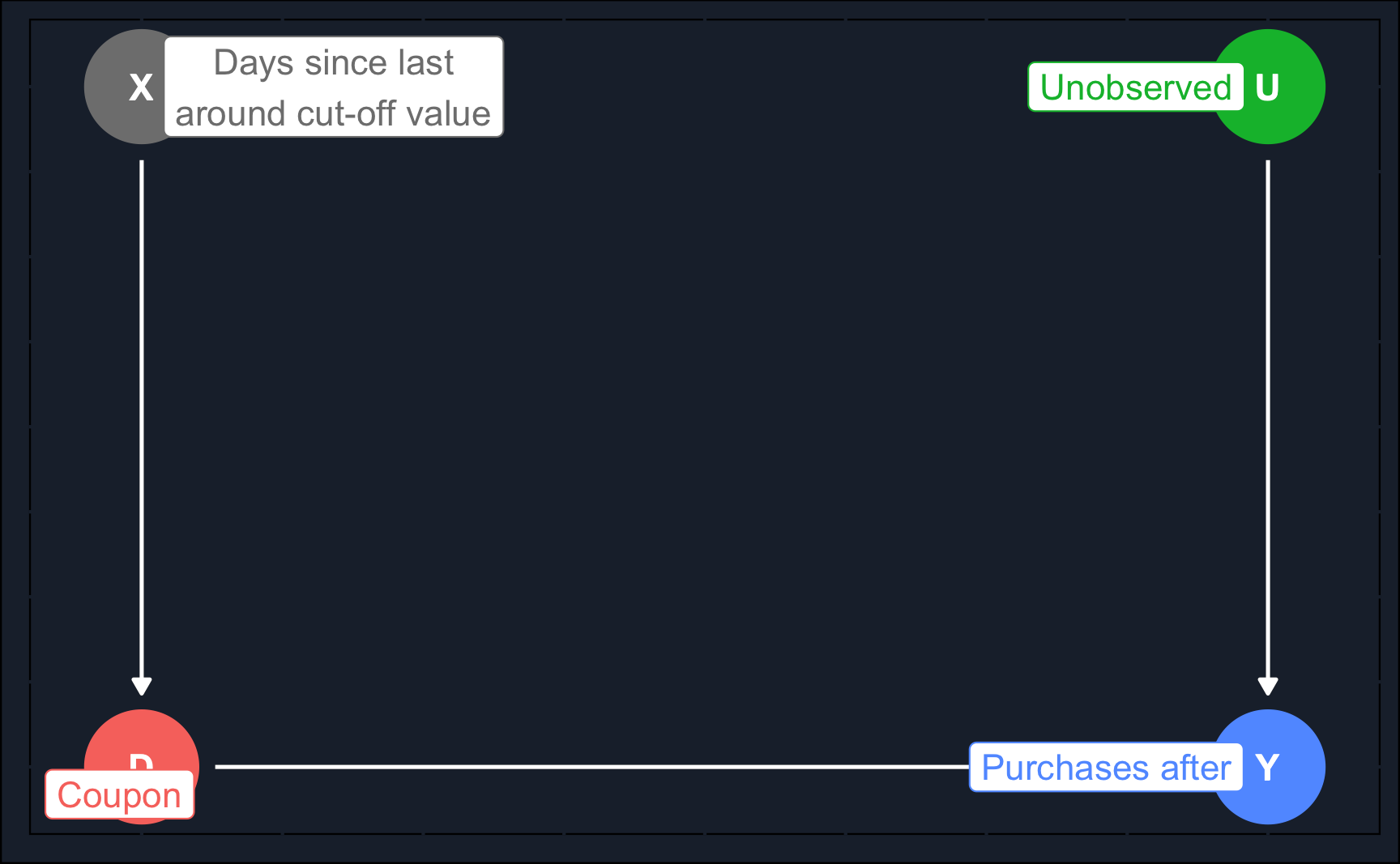
Illustrating the relationships in a DAG, we can see that for our running variable days_since_last being close to the cut-off value, we can estimate a local average treatment effect.
Code
# Running variable does not affect purchases itself as we only
# estimate a local average treatment effect. Also, there is no non-random
# heaping at cut-off.
library(dagitty)
library(ggdag)

# Directed Acyclic Graph
# Define
rdd <- dagify(
  Y ~ D,
  Y ~ U,
  D ~ X,
  exposure = "D",
  outcome = "Y",
  latent = "U",
  coords = list(x = c(Y = 1, D = 0, X = 0, U = 1),
                y = c(Y = 0, D = 0, X = 1, U = 1)),
  labels = list(X = "Days since last\naround cut-off value",
                Y = "Purchases after",
                U = "Unobserved",
                D = "Coupon")
)

# Plot
ggdag_status(rdd, text = T) +
  theme_dag_cds() +
  guides(color = "none") +
  geom_dag_text(color = "white") +
  geom_dag_edges(edge_color = "white") +
  geom_dag_label_repel(aes(label = label))
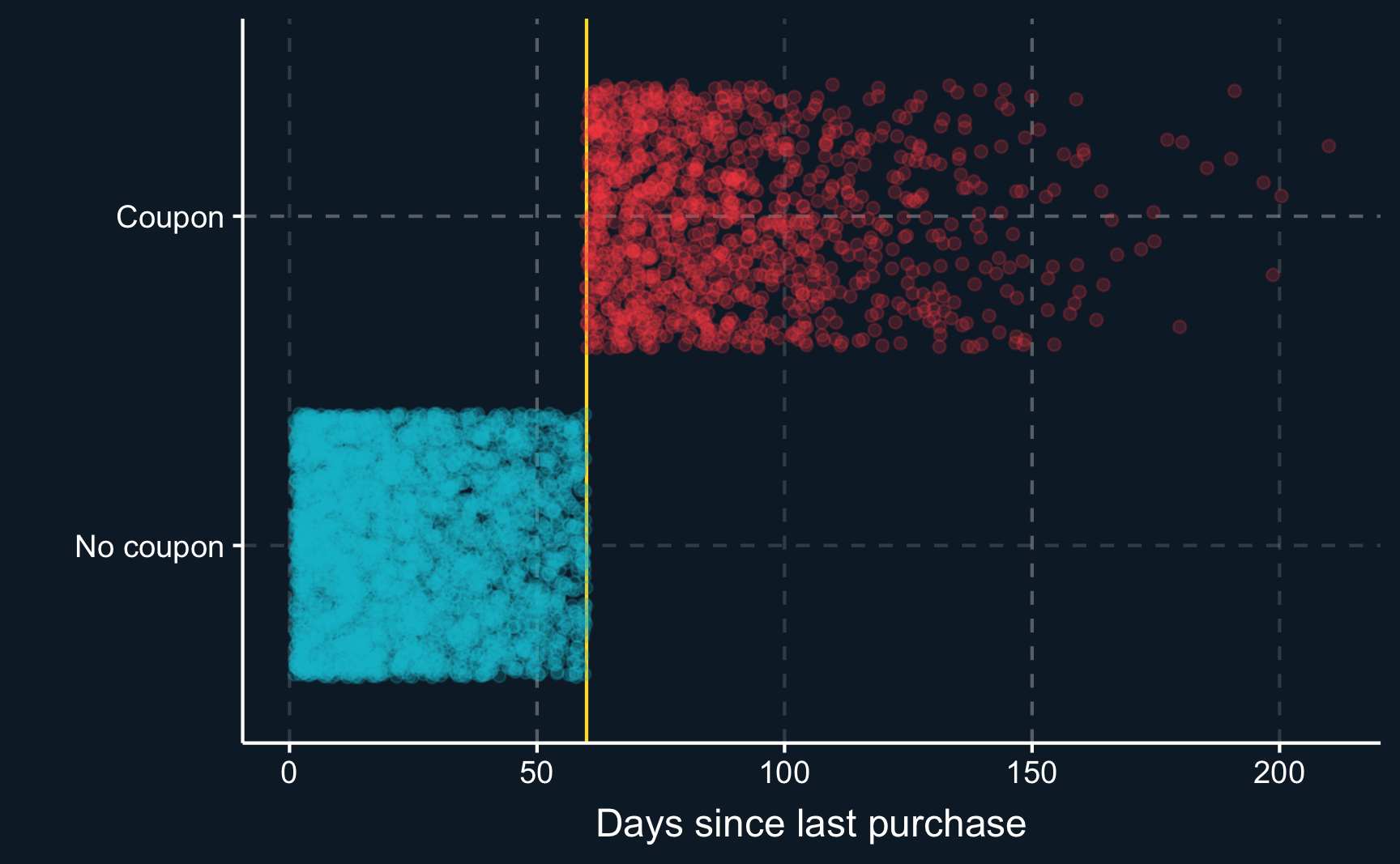
Because the coupons were assigned by a computer, we deal with a sharp cut-off. This means every customer with no purchase history within the last 60 days did receive the coupon and every customer with purchases made within this period did not receive it.
Code
# [2] Visualization ----
# [2.1] Compliance ----
# As expected, perfect "compliance" and sharp cutoff. All
# customers below the cutoff get no coupon, while all customers above
# the cutoff get a coupon.
compl <-
  ggplot(df, aes(x = days_since_last, y = coupon, color = coupon)) +
  geom_vline(xintercept = c0, color = ggthemr::swatch()[5]) +
  geom_point(alpha = 0.2, position = position_jitter()) +
  guides(scale = "none") +
  scale_y_discrete(labels = c("No coupon", "Coupon"))+
  scale_color_discrete(labels = c("No coupon", "Coupon")) +
  xlab("Days since last purchase") +
  ylab("") +
  theme(legend.position = "none")
complRandom assignment
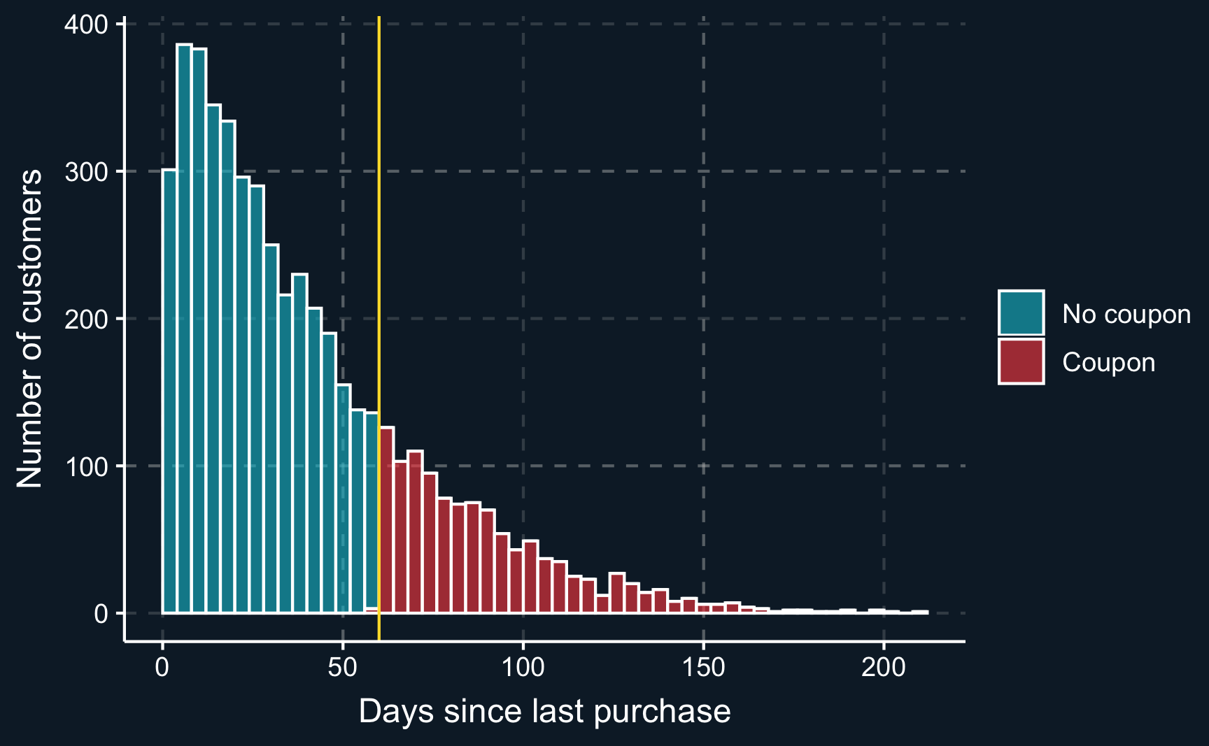
As already mentioned, for RDD to deliver valid results we have to make sure there is no non-random heaping at the cut-off, i.e. no manipulation because for example the effect is known and units attempt to move to one side of the cut-off. We can plot the distribution around the cut-off to check for violations of the continuity assumption.
We can see that there is no decline or incline at the cut-off and therefore can assume that the continuity assumption holds.
Code
# [2.2] Random assignment test ----
# identifying assumption: random assignment to either side of cut-off
# Manual plot
ggplot(df, aes(x = days_since_last, fill = coupon)) +
  geom_histogram(binwidth = 4, color = "white", boundary = c0, alpha = .6) +
  geom_vline(xintercept = c0, color = ggthemr::swatch()[5]) +
  scale_fill_discrete(labels = c("No coupon", "Coupon")) +
  xlab("Days since last purchase") +
  ylab("Number of customers") +
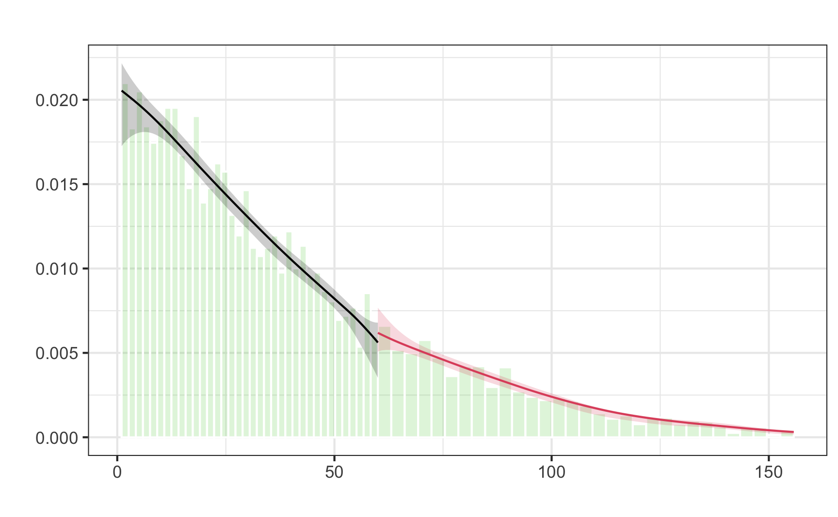
theme(legend.title = element_blank())To check the continuity assumption more thoroughly, we can also use functions of the rddensity package. Using a so-called McCrary density test, we obtain a p-value indicating how confident we are that our assumption is satisfied. As the p-value (\(=.24\)) is larger than any common \(\alpha\) value, we reject the null hypothesis that the number of units at either side are different. Our assumption is satisfied.
# Density test
# Check for continuous density along running variable. Manipulations could
# lead to running variable being "crowded" right after cutoff.
library(rddensity)
rddd <- rddensity(df$days_since_last, c = c0)
summary(rddd)
Manipulation testing using local polynomial density estimation.

Number of obs =       5000
Model =               unrestricted
Kernel =              triangular
BW method =           estimated
VCE method =          jackknife

c = 60                Left of c           Right of c
Number of obs         3854                1146
Eff. Number of obs    1486                734
Order est. (p)        2                   2
Order bias (q)        3                   3
BW est. (h)           31.203              31.915

Method                T                   P > |T|
Robust                1.1559              0.2477


P-values of binomial tests (H0: p=0.5).

Window Length / 2          <c     >=c    P>|T|
0.500                      20      20    1.0000
1.000                      31      35    0.7122
1.500                      44      47    0.8341
2.000                      70      68    0.9322
2.500                      92      89    0.8819
3.000                     110     105    0.7851
3.500                     123     118    0.7967
4.000                     135     129    0.7584
4.500                     148     142    0.7691
5.000                     164     159    0.8239
Additionally, the plot confirms our assumption. You can see that the confidence intervals overlap. If they did not overlap, we would have to suspect some kind of manipulation around the cut-off and could not use RDD to obtain valid results.
# Visually check continuity at running variable
rdd_plot <- rdplotdensity(rddd, df$days_since_last, plotN = 100)
Visualization
Having checked potential violations of the continuity assumptions, we can move on and estimate the treatment effect. We start with selecting a bandwidth, i.e. we select what and how many observations should be compared. The larger the bandwidth, the more observations are taken into consideration but it also reduces the comparability because observations at the respective limits might not be similar enough. On the other hand, choosing a small bandwidth results in a lower number of observations but ensures similarity and comparability.
There is no safe rule how to best select the bandwidth, although there are algorithms attempting to look for the optimal bandwidth. For now, we just use common sense and select a bandwidth of 5 days, resulting in an analysis window \([55, 65]\), which still leaves us with about 300 observations.
# [3] Dependent variable ----
# [3.1] Average Treatment Effect ----
# Plot regression lines for full and specified bandwidth.
# Specify bandwidth
bw <- c0 + c(-5, 5)

# Subsets below and above threshold in specified bandwidth
df_bw_below <- df %>% filter(days_since_last >= bw[1] & days_since_last < c0)
df_bw_above <- df %>% filter(days_since_last >= c0 & days_since_last <= bw[2])

# Alternative way to define tables
# df_bw_below <- df %>% filter(days_since_last >= bw[1], days_since_last  < c0)
# df_bw_above <- df %>% filter(days_since_last >= c0, days_since_last <= bw[2])

df_bw <- bind_rows(df_bw_above, df_bw_below)
dim(df_bw)
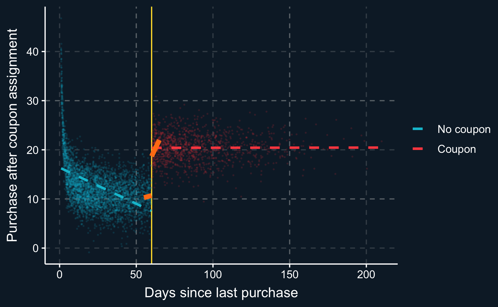
[1] 323 4To illustrate the difference between using only a small window and all data, we plot the resulting regression lines. You can see that both approaches would lead to different results.
Code
# Plot dependent variable vs running variable
dep_var <-
  ggplot(df, aes(x = days_since_last, y = purchase_after, color = coupon)) +
  geom_vline(xintercept = c0, color = ggthemr::swatch()[5]) +
  geom_point(alpha = 0.1, size = 0.2) +
  # add lines for the full range
  geom_smooth(data = filter(df, days_since_last <= c0),
              method = "lm", se = F, linewidth = 1, linetype = "dashed") +
  geom_smooth(data = filter(df, days_since_last > c0),
              method = "lm", se = F, linewidth = 1, linetype = "dashed") +
  # add lines for specified bandwidth
  geom_smooth(data = df_bw_below, method = "lm", se = F,
              color = ggthemr::swatch()[7], linewidth = 2) +
  geom_smooth(data = df_bw_above, method = "lm", se = F,
              color = ggthemr::swatch()[7], linewidth = 2) +
  scale_color_discrete(labels = c("No coupon", "Coupon")) +
  xlab("Days since last purchase") +
  ylab("Purchase after coupon assignment") +
  theme(legend.title = element_blank())
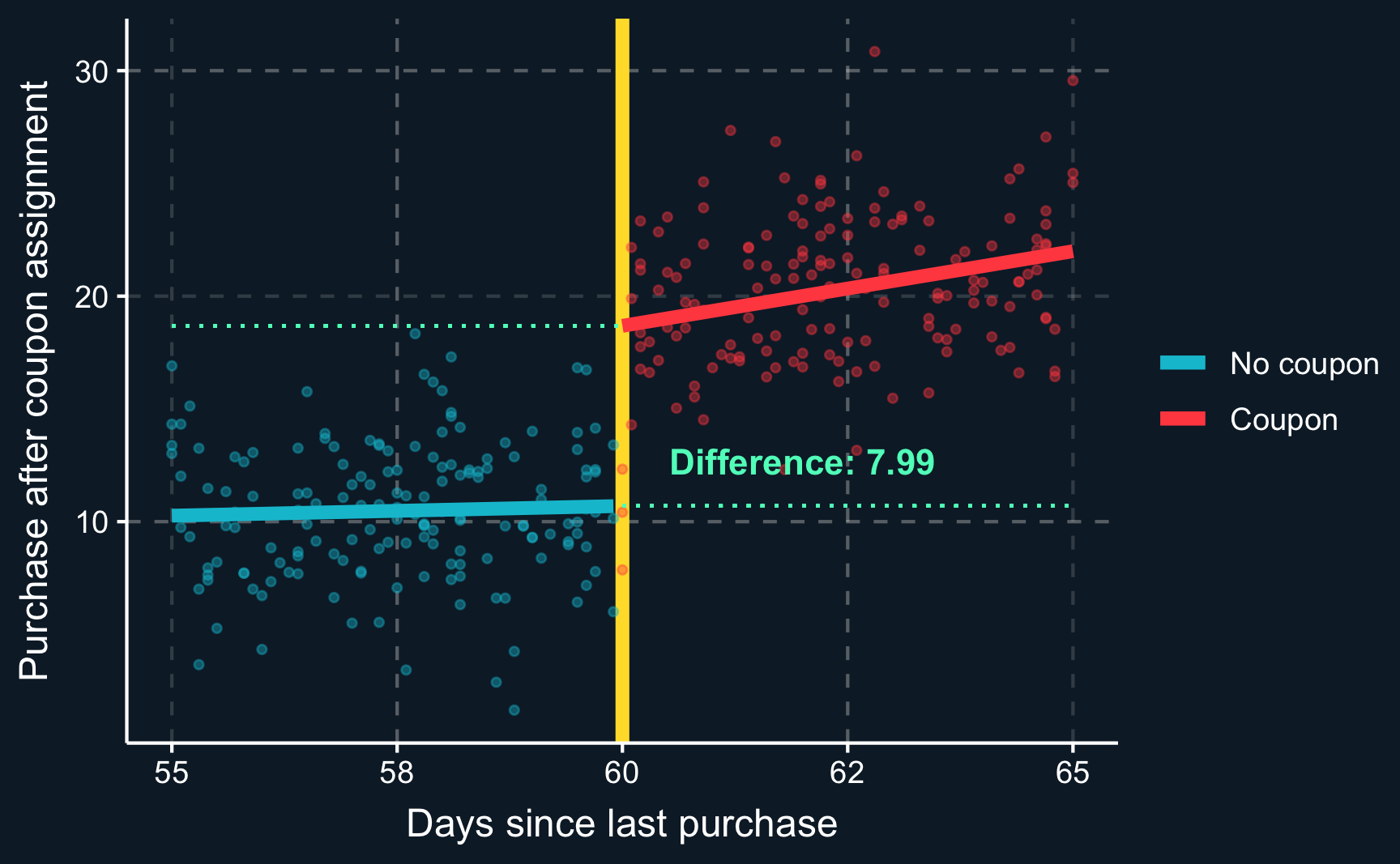
dep_varFrom the plot above, it is hard to see what the difference between observations close to the cut-off is. So what we can do is to compute two regressions, one for the observations in \([55, 60)\) and another one for the observations in \([60, 65]\).
Then, using the resulting coefficients, we compute what both models predict for the cut-off value \(c0\) and take the difference. The difference is the local average treatment effect (LATE).
# [3.2] Local Average treatment effect (LATE) ----
# Extract values for vertical lines to visualize local average treatment effect
model_bw_below <- lm(purchase_after ~ days_since_last, df_bw_below)
model_bw_above <- lm(purchase_after ~ days_since_last, df_bw_above)

y0 <- predict(model_bw_below, tibble(days_since_last = c0))
y1 <- predict(model_bw_above, tibble(days_since_last = c0))

late <- y1 - y0
sprintf("LATE: %.2f", late)
[1] "LATE: 7.99"It’s a bit messy when we plot all observations, so let’s zoom in to see if we can detect the local average treatment effect graphically. Not surprisingly, it is equal to what we have just computed.
Code
# Minimum and maximum for y-axis limits
min_y <- min(df_bw$purchase_after)
max_y <- max(df_bw$purchase_after)

# Add lines for vertical distance and change limits of x-axis.
dep_var_bw <-
  ggplot(df_bw, aes(x = days_since_last, y = purchase_after, color = coupon)) +
  geom_vline(xintercept = c0, color = ggthemr::swatch()[5], linewidth = 2) +
  geom_point(alpha = 0.4, size = 1) +
  geom_smooth(data = df_bw_below, method = "lm", se = F, linewidth = 2) +
  geom_smooth(data = df_bw_above, method = "lm", se = F, linewidth = 2) +
  geom_segment(aes(x = c0, xend = bw[2], y = y0, yend = y0),
             linetype = "dotted", color = ggthemr::swatch()[4]) +
  geom_segment(aes(x = bw[1], xend = c0, y = y1, yend = y1),
               linetype = "dotted", color = ggthemr::swatch()[4]) +
  annotate("text", x = c0+2, y = mean(c(y1, y0)-2),
           label = sprintf("Difference: %.2f", (y1 - y0)),
           color = ggthemr::swatch()[4], fontface = 2) +
  scale_y_continuous(limits = c(min_y, max_y)) +
  scale_color_discrete(labels = c("No coupon", "Coupon")) +
  xlab("Days since last purchase") +
  ylab("Purchase after coupon assignment") +
  theme(legend.title = element_blank())
dep_var_bwEstimation
What you will see most in studies is a regression to compute the LATE. That means, we can use the lm() command again. Instead of raw days_since_last variable, we prefer to use days_since_last_centered, which is the raw days_since_last variable centered, i.e. subtracted by the cut-off value \(c_0\). That simplifies the interpretation, however, it does not change the coefficient of interest, the LATE and also not the coefficient of days_since_last or days_since_last_centered. It merely shifts the intercept.
The coefficient we are most interested in is the one for couponTRUE. It is very to the effect in the plot above, but the regression summary also yields additional statistical information. We see that the LATE is statistically significant.
# [4] Estimation ----
# [4.1] Parametric ----
# Compute coefficients for specified bandwidth.
lm_bw <- lm(purchase_after ~ days_since_last_centered + coupon, df_bw)
summary(lm_bw)
Call:
lm(formula = purchase_after ~ days_since_last_centered + coupon,
    data = df_bw)

Residuals:
    Min      1Q  Median      3Q     Max
-11.497  -2.131  -0.095   2.019  10.416

Coefficients:
                         Estimate Std. Error t value Pr(>|t|)
(Intercept)                11.424      0.396   28.81   <2e-16 ***
days_since_last_centered    0.383      0.126    3.05   0.0025 **
couponTRUE                  7.933      0.709   11.19   <2e-16 ***
---
Signif. codes:  0 '***' 0.001 '**' 0.01 '*' 0.05 '.' 0.1 ' ' 1

Residual standard error: 3.2 on 320 degrees of freedom
Multiple R-squared:  0.707, Adjusted R-squared:  0.706
F-statistic:  387 on 2 and 320 DF,  p-value: <2e-16
Assignment
For the first assignment, use the data from the just discussed application (coupon.rds). When conducting a regression discontinuity design, one parameter that is chosen somehow arbitrarily is the bandwidth. Check how sensitive the result is to changing the bandwidth by running the analysis
- with half the bandwidth
- with double the bandwidth
Now consider a different past campaign. For a limited amount of time, for purchases with a total amount of more than 30€ you offered free shipping. The data can be seen in shipping.rds. Have a look at the variable purchase_amount and argue whether it could generally be used as a running variable with a cut-off at 30€.
- Use a plot to confirm your argument.
Please see here how you have to successfully submit your solutions. I would recommend you to solve the assignments first in .R scripts and in the end convert them to the required format as explained in the submission instructions.
