Regression and Statistical Inference
Introduction
Statistical inference aims to draw conclusions about relationships between variables in the whole population. Whole population, in this context, does not necessarily mean the whole world population but instead the set of all units we want to draw conclusions about. Units could be for example all students in a country, all children in a specific institution or things like stores, restaurants etc. In the business context, we will often deal with populations that comprise customers, employees, stores or other business-related units.
In practice, it is often impossible to collect data about the whole population, which is why we draw (ideally random) samples from the whole population and use statistical inference to draw conclusions about the whole population using the smaller sample. This is one main reason why we needed to introduce concepts from probability theory and statistics in the previous chapter.
Linear Regression
It is undisputed that the most important method in statistical inference is the linear regression, which has been used extensively in practical and scientific applications due to its desirable mathematical properties and its convenient interpretation.
In this course, we will use linear regression in combination with other methods to explain and interpret relationships and effects between random variables. In general we aim to answer the question: how does changing one variable affect another variable? There are also another purpose that linear regression could be used for, namely as a prediction method. However, prediction is not the focus of this course and in fact, there are actually many other methods that surpass linear regression for prediction tasks. On the other hand, for explanation and interpretation purpose, which are fundamental for causal reasoning, linear regression has proved to be a very suitable method.
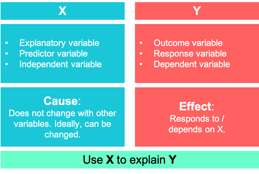
It builds upon many of the statistical concepts that were explained in the previous chapter, such as conditional expectations, variance, covariance, correlation etc. Formally, we want to explain an outcome \(Y\) (also called response or dependent variable) using an explanatory variable \(X\) (also called predictor or independent variable). A popular example, that over decades has been researched extensively, is to explain the effect of smoking on lung cancer. Here, smoking is the explanatory variable \(X\) and lung cancer \(Y\) is the outcome.
Let’s use a simple example to show how linear regression works and how we can implement it in R. First, we consider a model with one explanatory variable:
\[ y=\beta_0+\beta_1x+u \]
This equation represents the so called population model which we could obtain if we had data about the whole population. But as already mentioned, we usually cannot observe the whole population and only have a small sample of the population. Withs this sample and a few assumptions we will try to estimate values for the parameters of interest, \(\beta_0\) and \(\beta_1\). When dealing with causal models, \(y\) is thought of as effect and \(x\) as cause. \(\beta_0\) is called the intercept while \(\beta_1\) is known as the coefficient of the slope.
Also note, that the model does not rule out other causes by including an error term \(u\), that contains all (unobserved) factors potentially affecting \(y\). As we will visualize below, in the whole population, the expected value of this term is assumed to be zero (it does not mean it is zero for everyone).
\[ E(u) = 0 \]
However, this is a rather trivial assumption as it is always possible for the error term to be zero by balancing the terms \(u\) and the intercept \(\beta_0\). An assumption that is way more important in a statistical sense and in order to interpret parameters as causal parameters in the following sections, is the mean independence of \(u\) from \(x\), which states that
\[ E(u\mid x)=E(u)\ \text{for all values $x$} \]
In many cases, this assumption is violated, as unobserved factors contained in \(u\) are correlated with observed factors in \(x\). However, as the first assumption is always fulfilled by definition of linear regression algorithms, there is a high risk of not detecting the failure of second assumption, which in turn leads to biased results. Therefore, it is crucial to always argue why the assumption holds in a particular application.
Both assumptions can be combined into one assumption, known as the zero conditional mean assumption
\[ E(u\mid x)=0,\ \text{for all values $x$} \]
yielding the conditional expectation function of \(y\) being a linear function of \(x\)
\[ E(y\mid x)=\beta_0+\beta_1x \]
with \(u\) being left out as it is zero on average.
In the following chapters, we will talk in detail about cases where this assumption might not hold and what approaches there are to deal with it.
Estimation
R
We start using a simple example to get an intuition of how the linear regression is estimated and how it is implemented in R. For presentation purposes, we sample the data ourselves and also define the relationship between the variables.
Before we start, we load the R package tidyverse, which actually is collection of several useful packages for data manipulation, visualization and other data science purposes. Throughout the course, we will almost always load it.
We create a tibble, which is a table containing data, with two columns, \(x\) and \(y\). For \(x\), we draw ten random samples from the normal distribution with a mean of 3 and a standard deviation of 1. The outcome variable \(y\), we make dependent on \(x\), i.e. for each unit \(i\), we create a \(y_i\) as
\[ y_i = 0.3x_i + \epsilon_i \,\,\,\,\,, \]
where \(\epsilon_i\) is random noise.
Let’s have a look at how the data is presented. We have a table containing 10 rows and two columns. Each row is an observation for a different unit, which could be a person, a point in time or another kind of measurement. It is only important that the values in a particular row belong together.
# Simluate data

# number of observations
n <- 10

# Create tibble
lm_dat <- tibble(
  # draw from normal distribution
  x = rnorm(n, mean = 3, sd = 1),
  # y depends on x and noise from normal distribution
  y = 0.3*x + rnorm(n, 0, 0.2)
)

# Show data
lm_dat
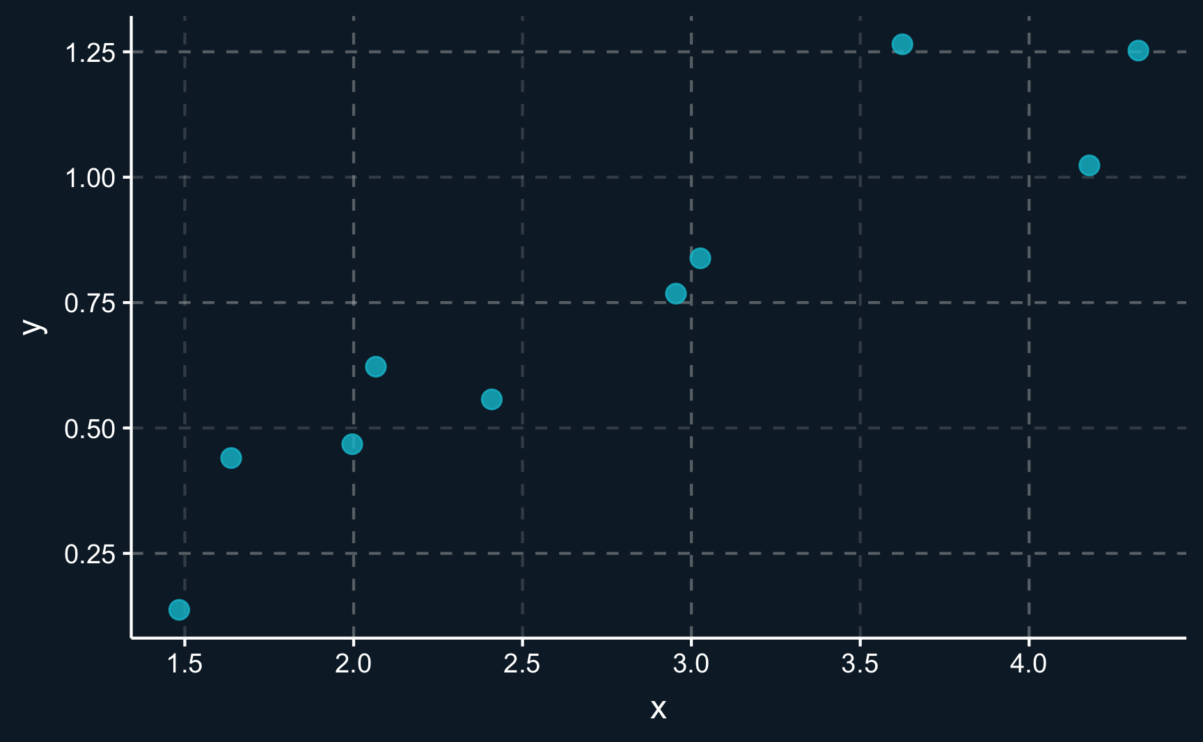
A handy first step if you work with a new data set is always to plot the data in a sensible way. Dealing with two-dimensional continuous data, a scatter plot is usually the best choice.
ggplot2 is a data visualization package that comes with tidyverse. There are also base R graphics, but ggplot2 allows you to modify components with way more options. In its most basic form, the grammar works as follows:
Provide the data:
ggplot(data, …)Define aesthetics:
ggplot(data, aes(x = x, y = y)Add geometric objects: e.g.
+ geom_bar()
# Scatter plot of x and y
ggplot(lm_dat, aes(x = x, y = y)) +
  geom_point(size = 3, alpha = 0.8) # change size and opacity of points
An experienced analyst could already see how the variables are related. There seems to be a positive correlation between \(X\) and \(Y\). However, it not a perfect correlation and there is a certain degree of noise, meaning that not all points lie on an imaginary line.
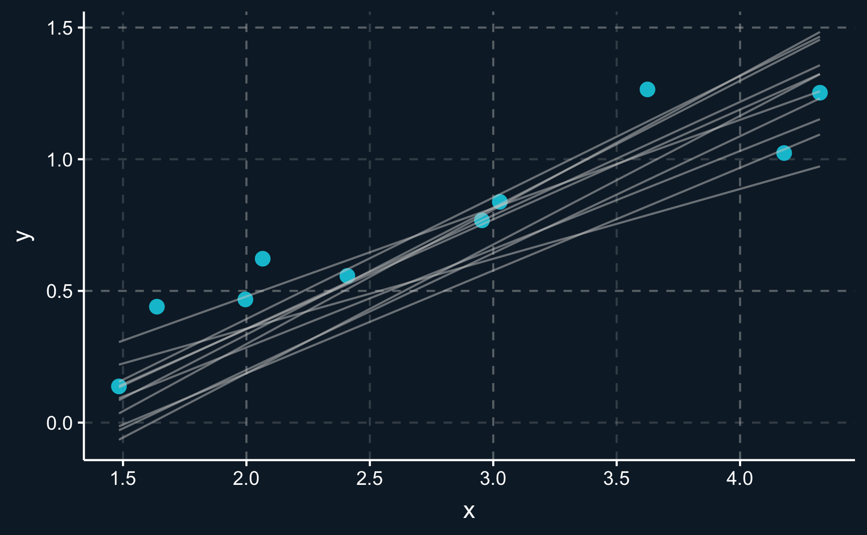
The goal of linear regression is now to find a line that goes through the points. But not any line, in fact, it has to be the line with the best fit. Differently put, it has to be the line that is - on average - as close to the observation points as possible.
Let’s have a look at some random lines. Please note that there is an infinite amount of lines that we could draw but we stick to lines that seem somehow realistic.
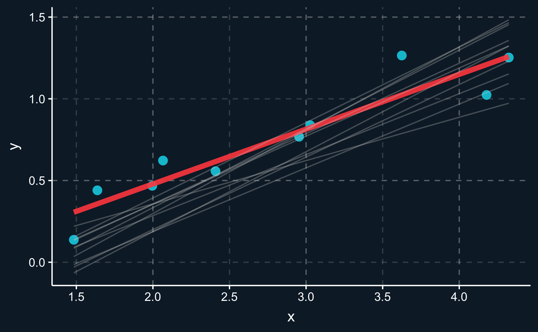
You can see there is an infinite amount of potential lines that could be chosen to go through the data. But only one of them is the line minimizing the sum of squares. The residual, which is the distance between the line and an observation, should be minimized. This also means that on average, the residuals are zero.
The true best line is highlighted in red.
If we want to mathematically compute the line in R, we can use the lm() function and provide data and the assumed functional relationship as arguments. lm() is a function you will see a lot and it is used to fit linear models. It returns a fitted object (here: lm_mod), which we can interpret best when using summary() to show the resulting coefficients and other statistical information.
lm() is a function that fits a linear model. You have to provide data and a regression equation in the form of for example outcome ~ regressor_1 + regressor_2 or outcome ~ ., if you want to include all variables except for the outcome as regressors. To see the computed coefficients and their statistical significance, you need to call summary().
Looking at the regression summary, we see that the line is modeled by \(y = -0.1918 + 0.3354*x\). It means that for the fitted model, an increase of one unit in \(x\) is related to an 0.3354 increase in \(y\). That is relatively close to what we simulated (0.3). But because we added random noise in our simulation it slightly differs.
Call:
lm(formula = y ~ x, data = lm_dat)

Residuals:
     Min       1Q   Median       3Q      Max
-0.18597 -0.05210 -0.00783  0.06584  0.24115

Coefficients:
            Estimate Std. Error t value Pr(>|t|)
(Intercept)  -0.1918     0.1300   -1.48     0.18
x             0.3354     0.0443    7.57  6.5e-05 ***
---
Signif. codes:  0 '***' 0.001 '**' 0.01 '*' 0.05 '.' 0.1 ' ' 1

Residual standard error: 0.14 on 8 degrees of freedom
Multiple R-squared:  0.878, Adjusted R-squared:  0.862
F-statistic: 57.3 on 1 and 8 DF,  p-value: 6.48e-05
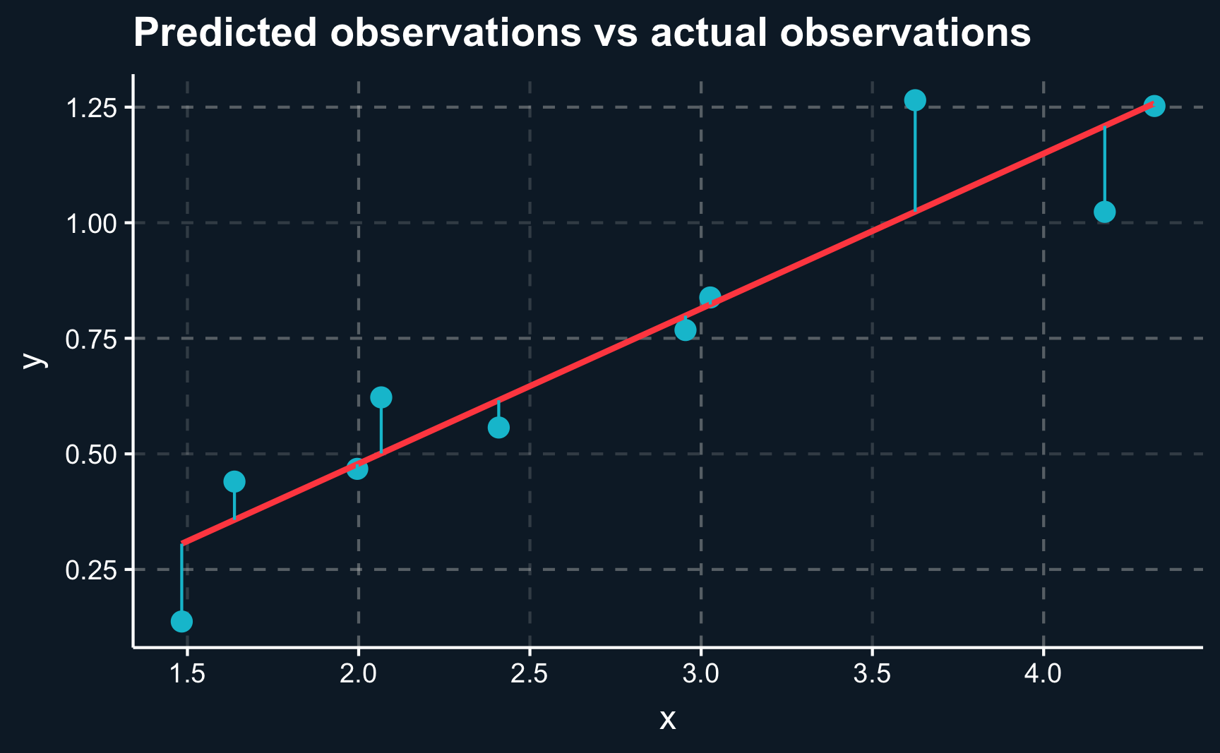
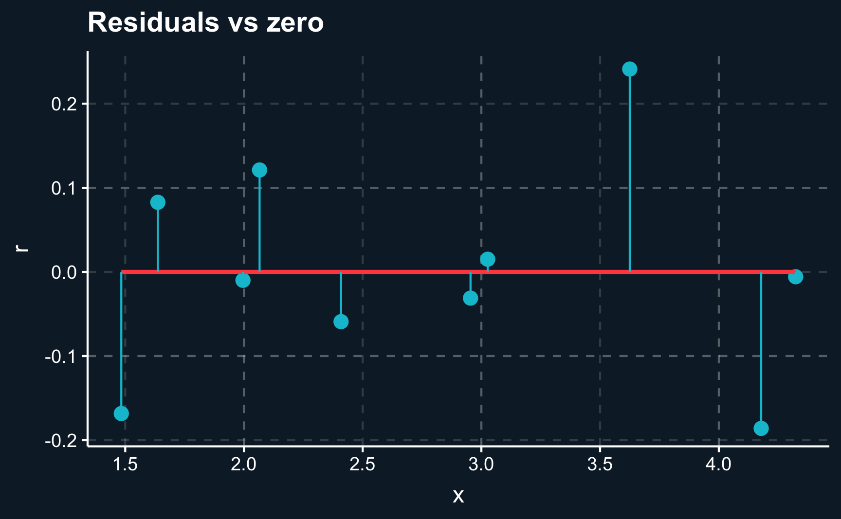
Now, let’s check how far we are off with our predictions by plotting the regression line against the actual observations. There are two ways to to do it, by either plotting the observations \(y_i\) and predictions \(\hat{y_i}\) for each \(i\) or plotting the residuals \(r_i = y_i - \hat{y_i}\) and comparing it to the \(x\)-axis.
# Add fitted values and residuals to data
lm_dat_fit <- lm_dat %>%
  mutate(y_fit = predict(lm_mod),
         r   = y - y_fit)

# Plot distance of actual to fit
ggplot(lm_dat_fit, aes(x = x, y = y)) +
  geom_point(size = 3) +
  geom_smooth(method='lm', formula= y ~ x, se = F) +
  geom_segment(aes(xend = x, yend = y_fit), color = ggthemr::swatch()[2]) +
  labs(title = "Predicted observations vs actual observations")
# Plot residuals
ggplot(lm_dat_fit, aes(x = x, y = r)) +
  geom_point(size = 3) +
  geom_smooth(method='lm', formula= y ~ x, se = F) +
  geom_segment(aes(xend = x, yend = 0), color = ggthemr::swatch()[2]) +
  labs(title = "Residuals vs zero")
We can see that although we are not able to perfectly capture each data point, the line on average is as close as possible. We cannot get any closer as the data points deviate in both directions.
Math
Mathematically, the best line is found by the ordinary least squares (OLS) method.
Note that estimation is always done in software programs or language as it gets too complex to be solved by hand very fast. However, to get a good understanding of what is going on and what is optimized, it is worth to look at the equations and conditions.
Given \(n\) samples of observed pairs of dependent and independent variables \(\big\{(x_i,\ \textrm{and}\ y_i): i=1,2,\dots,n \big\}\), we plug all of them into the equation
\[ y_i=\beta_0+\beta_1x_i+u_i \]
and together with our assumptions \(E(u) = 0\) and \(E(u|x)=0\) we obtain the equations to be solved to retrieve estimates for \(\beta_0\) and \(\beta_1\).
From the independence of \(x\) and \(u\) and our understanding of probabilities and expectations, we also know that the expected value of the product of \(x\) and \(u\) has to be zero: \(E(xu)=0\). Substituting \(u\) with \(y-\beta_0-\beta_1\), we obtain the two conditions that when being solved give us the optimal estimates for our \(\beta\) parameters.
\[ \begin{align} E(y-\beta_0-\beta_1x) = E\Big(x[y-\beta_0-\beta_1x]\Big) = 0 \end{align} \]
Translated into its sample counterpart:
\[ \begin{align} \dfrac{1}{n}\sum_{i=1}^n\Big(y_i-\widehat{\beta_0}-\widehat{\beta_1}x_i\Big) = 0 \\ \dfrac{1}{n}\sum_{i=1}^n \Big(x_i \Big[y_i - \widehat{\beta_0} - \widehat{\beta_1} x_i \Big]\Big) =0 \end{align} \]
Looking at the sample equations, we know our sample size \(n\), our sampled values \(y_i\) and \(x_i\). The coefficients \(\hat{\beta}_0\) and \(\hat{\beta}_1\), where the hat denotes that the parameter is not the population parameters but coming from a sample, are unknown. However, two unknowns and two equations makes the problem algebraically feasible.
Skipping a few transformation steps, we obtain
\[ \widehat{\beta}_1 = \dfrac{\sum_{i=1}^n (x_i-\overline{x}) (y_i-\overline{y})}{\sum_{i=1}^n(x_i-\overline{x})^2 } =\dfrac{\widehat{Cov}(x_i,y_i) }{\widehat{Var}(x_i)} \]
What is very interesting to see (although we actually know it from the previous chapter) is that the OLS estimate for our \(\beta_1\) is defined as the covariance of \(X\) and \(Y\) divided by the variance of \(X\). It also shows that the variance of \(X\) has to be greater than zero, which means that not all values of \(x_i\) can be the same. You need to observe different values to be able to estimate how \(y_i\) reacts to \(x_i\).
\(\beta_0\) follows directly by plugging \(\beta_1\) into \(\widehat{\beta}_0=\overline{y} - \widehat{\beta_1}\overline{x}\). A bar above a variable always represents the sample value of that particular variable. Thus, \(\beta_0\) is (as expected) constant and linear in \(\beta_1\).
Knowing the equation for the regression line, we can compute fitted values \(y_i\) for all \(i\)
\[ \begin{align} \widehat{y_i}=\widehat{\beta}_0+\widehat{\beta}_1x_i\end{align} \]
In almost all cases however, \(\widehat{y}_i\) won’t be equal to \(y_i\) but there will be a prediction error, commonly referred to as residual \(\widehat{u}_i\). Make sure that you don’t mix it up with \(u\), the error term, which is always unobserved.
What should we already know about the residuals? As already mentioned and visualized we have been looking for the regression line that is on average as close to the observed values as possible.
A slightly different perspective, but with the exact same implications, is therefore to look at the sum of squared residuals and bring their sum as close to zero as possible by changing the coefficients for the regression line.
Squares are used to avoid that positive and negative errors balance each other out. You could also use absolute deviations from the fitted line, but squares have some desirable properties when doing calculus.
\[ \sum_{i=1}^n \widehat{u_i}^2 =\sum_{i=1}^n (y_i - \widehat{y_i})^2 \\= \sum_{i=1}^n \Big(y_i-\widehat{\beta_0}-\widehat{\beta_1}x_i\Big)^2 \]
Again, most of the residuals won’t be zero, but on average the line going through all observations is the best fitting line with residuals being zero on average.
Application
Now let’s use a more complex model to learn more about how results of a linear regression can be interpreted and how statistically significant results are defined.
In this application, imagine you work for a health insurance company and your task is to estimate the annual expected cost of a (potential) customer based on his/her characteristics. Based on historical data, you want to see what characteristics affect the cost.
Let’s create a synthetic data set for our application. In practice, you obviously would not need to create the data first but we have to due to the lack of real data which is generally kept under lock by insurance companies. However, the advantage of using synthetic data is that we know the data-generating process and check if our estimates are correct or if they are are biased.
You don’t need to worry about how to create a synthetic data set at this point. But for those who are interested, the package fabricatr has some very useful functions and a very well written documentation.
We simulate a couple of factors, of which some do and some does not affect the expected cost of a customer. The factors we simulate are sex, age, BMI, children, smoking, region and income.
Code
# [0] Data ----
# Simulate data for a multivariate linear regression. Introduction, therefore
# disregarding causality of effects.
# Application: Health insurance company wants to estimate expected annual cost
# of potential customer based on various characteristics such as sex, age, BMI,
# children, smoking status, region, salary

# empirical distributions to draw from
income_sample <- 1e+4 * rbeta(1e+6, 2, 5)
bmi_sample <- 12 + 50 * rbeta(1e+6, 2, 5)

# custom function to generate correlated variables based on given variable
# and empirical sample
draw_custom <- function(data, quantile_y) {
  quantile(data, quantile_y)
}

library(fabricatr)
# sex, age, BMI, children, smoking status, region, salary
df <- fabricate(
  N = 1e+3,
  # randomly assign a region
  region = draw_categorical(prob = rep(0.25, 4),
                            N = N,
                            category_labels = c("N", "E", "S", "W")),
  # randomly assign sex
  sex = draw_binary(0.5, N = N),
  # randomly assign smoking (yes/no)
  smoking = draw_binary(prob = 0.25, N = N),
  # age distribution (18-70): younger or older people would not sign up for an
  # insurance as they are either already insured or insured via their parents
  age = (100*rbeta(1000, 1.4, 1)) %>% scales::rescale(to = c(18, 70)),
  # generate income based on age and income sample distribution
  income = correlate(draw_custom,
                      data = income_sample,
                      given = age,
                      rho = 0.4),
  # generate BMI based on age and BMI sample distribution
  bmi = correlate(draw_custom,
                  data = bmi_sample,
                  given = age,
                  rho = 0.3),
  # generate children (yes/no) based on age
  children = draw_ordered(x = rnorm(N,age, sd = 20), breaks = c(35)) - 1,

  # compute expected cost based on income, smoking, bmi and age
  expected_cost = 100 + -0.05*income + 200*smoking + 2*((bmi-30) + (bmi-30)^2) +
    10*age + rnorm(N, 100, sd = 100)
  ) %>%
  as_tibble() %>%
  select(-ID)
Let’s also save the data.
# Save data set
saveRDS(df, "../../datasets/health_ins.rds")
If you don’t want to create the data yourself, you could instead download it from here. All data sets that you are going to need for replicating examples and solving the assignments are stored there.
Loading data is generally referred to as “reading” the data and can be done for a variety of formats. One format, that is particularly convenient in R is the .rds format. An .rds file can be read with readRDS(path) and saved with saveRDS(df, path). Note that the path argument depends on where you want to save an object or where you want to load it from. It is probably different from the path I used.
Reading/saving commands for other file formats are for example
read_csv()andwrite_csv()from thereadrpackageread_delim()andwrite_delim()from thereadrpackagegetcwd()will tell you what directory you are currently in. When you specify the path, you can also use yourTabkey to see where you are...moves you one folder upwards.
# Read data set. Check what folder/path your data is in.
df <- readRDS("../../datasets/health_ins.rds")
Often, you will deal with large data sets that do not fit on a single page and thus are not easily comprehensible. To gain a thorough understanding and check your data, you can use various functions.
Most data scientists start by using the head() command, which returns the first part of the table and shows you the data structure. Also, if something is wrong with your data, because you did not load it correctly or headers do not fit the data, you were able to see it here already.
Here, we see that our table consists of different column types, such as integers, doubles and factors.
# Show first lines
head(df)
An option not available in RStudio, but in documents like this one here, is to view a paged table by just typing in the name of the object. In RStudio, the best way to look at a table is View() or view(), which opens the table in a readable format.
# Show table
df
If you have too many columns to fit on one page, you could also use glimpse(), which lists columns and their first values row by row.
# Get glimpse of data
glimpse(df)
Rows: 1,000
Columns: 8
$ region <fct> E, N, W, N, S, S, E, S, W, N, S, E, E, S, E, N, E, N, W, E, W, E, S, S, W, N, W, N, W, E, E, W, E, E, W, E, S, W, E, N, E, E, …
$ sex <int> 0, 1, 0, 0, 0, 1, 0, 1, 0, 0, 1, 0, 1, 1, 0, 0, 0, 0, 1, 0, 0, 0, 1, 1, 1, 1, 1, 1, 1, 1, 1, 0, 1, 1, 0, 0, 1, 0, 0, 0, 0, 0, …
$ smoking <int> 0, 1, 1, 0, 0, 0, 0, 0, 1, 0, 0, 0, 0, 0, 0, 0, 0, 0, 0, 1, 0, 0, 1, 1, 1, 1, 1, 1, 0, 1, 0, 0, 1, 0, 1, 0, 0, 1, 0, 1, 0, 0, …
$ age <dbl> 55, 20, 56, 43, 22, 21, 26, 51, 69, 43, 24, 62, 49, 65, 58, 30, 65, 23, 37, 56, 46, 51, 58, 51, 52, 44, 18, 30, 30, 40, 33, 34…
$ income <dbl> 3410, 1313, 2071, 3310, 1636, 860, 907, 1596, 3319, 3015, 4352, 3498, 2825, 1992, 4763, 1191, 5809, 3905, 1909, 3877, 4302, 49…
$ bmi <dbl> 28, 22, 22, 27, 22, 19, 20, 16, 36, 16, 19, 43, 43, 31, 22, 22, 35, 30, 35, 30, 29, 31, 24, 40, 29, 17, 13, 35, 20, 19, 19, 29…
$ children <dbl> 1, 0, 1, 0, 0, 1, 1, 1, 1, 0, 1, 1, 0, 1, 1, 0, 1, 0, 0, 0, 0, 0, 1, 1, 1, 1, 0, 1, 0, 1, 1, 0, 1, 0, 1, 0, 0, 1, 1, 1, 0, 1, …
$ expected_cost <dbl> 603, 631, 1006, 521, 431, 659, 761, 850, 945, 972, 454, 1026, 775, 607, 692, 504, 579, 169, 760, 806, 531, 476, 968, 835, 660,…Similar to head(), it returns the general structure and data types.
A command yielding a more concise description of the data is summary(), that besides data types also returns summary statistics. For factor (= categorical) variables, it counts the occurrences and for numeric variables (discrete, continuous) variables, it returns minimum/maximum values, median/mean and quartiles. For binary variables, the only value of interest is generally the mean, which is equal to the proportion.
When we take a look at a summary of our data set, we see that it includes a variety of data types: Variables are continuous, discrete, binary/logical or even categorical/factors. Continuous variables or discrete variables have numeric values, which we have already seen in the previous example, are easy to work with when doing the needed calculus. But what about the other types?
Logical variables, which take either the value TRUE or FALSE are in fact discrete, or to be more precise binary values. So you can change the value of TRUE to 1 and FALSE to 0. Then, they behave like discrete variables.
For categorical variables, in R they are called factors, it is a bit more complicated. If they follow a natural order e.g. like low, medium, high, they could be coded as discrete variables as well with e.g. the values \(0,1,2\).
# Show summary statistics: various types of variables (continuous, discrete,
# binary/logical, categorical/factor)
summary(df, digits = 3)
region sex smoking age income bmi children expected_cost
N:250 Min. :0.00 Min. :0.00 Min. :18 Min. : 117 Min. :13 Min. :0.00 Min. : 169
E:273 1st Qu.:0.00 1st Qu.:0.00 1st Qu.:38 1st Qu.:1715 1st Qu.:20 1st Qu.:0.00 1st Qu.: 586
S:246 Median :1.00 Median :0.00 Median :50 Median :2757 Median :25 Median :1.00 Median : 730
W:231 Mean :0.52 Mean :0.27 Mean :49 Mean :2985 Mean :27 Mean :0.71 Mean : 743
3rd Qu.:1.00 3rd Qu.:1.00 3rd Qu.:61 3rd Qu.:4010 3rd Qu.:32 3rd Qu.:1.00 3rd Qu.: 881
Max. :1.00 Max. :1.00 Max. :70 Max. :8480 Max. :52 Max. :1.00 Max. :1905 Let’s also check how the variables are correlated with each other. In case variables were fully linearly dependent, we could already see it here. Then, we were not able to run a linear regression or at least it would be meaningless.
7 x 7 Matrix of class "dtrMatrix"
                sex smoking   age income   bmi children expected_cost
sex            1.00       .     .      .     .        .             .
smoking        0.04    1.00     .      .     .        .             .
age           -0.02   -0.01  1.00      .     .        .             .
income         0.00    0.03  0.33   1.00     .        .             .
bmi           -0.03    0.00  0.32   0.11  1.00        .             .
children      -0.05    0.01  0.45   0.15  0.09     1.00             .
expected_cost -0.02    0.36  0.39  -0.16  0.06     0.17          1.00
Other than that, compared to our minimalist example from the previous section, there is not much we need to consider when fitting a multiple linear regression model. In fact, using the most popular lm() command for regression, we don’t even need to transform categorical variables ourselves. It is done automatically.
Interpretation
So let’s run the first regression. We will start by using all available characteristics as independent variables. That is what you will often find in studies. All variables that are available are included in the regression. Later, we will see why that might be dangerous and why we should be careful in selecting our variables.
Call:
lm(formula = expected_cost ~ ., data = df)

Residuals:
   Min     1Q Median     3Q    Max
-406.5 -123.9  -26.4  102.7  942.0

Coefficients:
             Estimate Std. Error t value Pr(>|t|)
(Intercept) 450.51998   28.77380   15.66   <2e-16 ***
regionE       8.57388   16.25854    0.53   0.5981
regionS      -1.99015   16.66160   -0.12   0.9049
regionW       1.65634   16.93503    0.10   0.9221
sex          -9.38273   11.77360   -0.80   0.4257
smoking     205.70391   13.21526   15.57   <2e-16 ***
age           9.29488    0.51525   18.04   <2e-16 ***
income       -0.05113    0.00384  -13.30   <2e-16 ***
bmi          -2.07654    0.76406   -2.72   0.0067 **
children     -9.25879   14.55410   -0.64   0.5248
---
Signif. codes:  0 '***' 0.001 '**' 0.01 '*' 0.05 '.' 0.1 ' ' 1

Residual standard error: 185 on 990 degrees of freedom
Multiple R-squared:  0.404, Adjusted R-squared:  0.398
F-statistic: 74.4 on 9 and 990 DF,  p-value: <2e-16
There is a lot we can learn from the regression summary. For each included coefficient and the intercept, there is a row containing the estimated coefficient, its standard error, t-statistic and p-value. The names in the R summary differ a bit, but have the same meaning.
The estimate is what we know as regression coefficient from before, typically denoted by \(\widehat{\beta}\) or other Greek letters. Let’s take for example \(\widehat{\beta_{age}}\). As it is the estimated version, it has a hat. The estimate for \(\beta_{age}\) tells you by how much the dependent variable \(\widehat{y}\) varies when \(age\) is increased by one unit while all other variables in the model are held at a constant level. A negative coefficient suggests a negative relationship, while a positive coefficient points to a positive relationship.
Holding all other variables constant and deriving the effect of a single variable is often described with the effect (in our example of \(x_{age}\)) ceteris paribus, Latin for “the others equal”. It is really important to keep that in mind, as it allows to view the coefficient as an estimate of an isolated effect. Sometimes it is also expressed as controlling for the other variables.
Statistical Significance
The standard error indicates the variation around the estimated coefficient. A high standard error indicates a lot of variation and high uncertainty while low standard errors provide more confidence in the estimate. (Remember the graph from the previous chapter that showed the histogram of a random variable with different values for the standard deviation.)
The other values are also concerned with the level of uncertainty there is in the estimation. They are related to the coefficient and standard error. Most widely used is the p-value, or probability value. It tests the so called null hypothesis against the observed data.
Let’s take the example of the correlation between smoking and expected_cost from the regression above. The null hypothesis states that there is no correlation between the dependent variable expected_cost and the independent variable smoking. The p-value shows, based on the observed data, how likely it is that your data would have occurred just by random chance. Thus, a low p-value provides support for the claim that the alternative hypothesis is true instead of the null hypothesis.The alternative hypothesis states, that there is indeed a correlation between the independent and the dependent variable. Because the p-value is low, we reject the null hypothesis and the alternative hypothesis (significant correlation) is true. If the previous paragraph wasn’t clear to you right away, please take a moment to reread it, as it contains crucial information.
Statistical significance can directly be derived from the p-value and an arbitrary significance level \(\alpha\). However, the most widely used level of \(\alpha\) is \(0.05\). Less often used are levels of \(.1\), \(.01\) or \(.001\).
An estimate with a p-value less than \(\alpha\) is considered statistically significant. Expressed in statistical jargon, we reject the null hypothesis of random results when the respective p-value is lower than our significance level \(\alpha\). Rejecting the null hypothesis indicates support for the alternative hypothesis (our observed estimate). Looking at the summary above, we see that \(age\), \(income\), \(bmi\), and \(smoking\) are statistically significant (at different levels though, indicated by the number of stars).
Another way to look at the significance of our estimates is to compute is to look at confidence intervals which derive from the estimate, standard error and the t-distribution - the same inputs as needed for p-values. A \((1-\alpha)\) confidence interval has a probability of \((1-\alpha)*100 \%\) to contain the true value of our estimated coefficient. That means, if we would sample \(100\) times, \(\widehat{\beta}\) would be contained in the sample \((1-\alpha)*100\) times.
# Show CIs at different levels of alpha
# alpha = 0.05
confint(lm_all, level = 0.95)
2.5 % 97.5 %
(Intercept) 394.055 506.985
regionE -23.331 40.479
regionS -34.686 30.706
regionW -31.576 34.889
sex -32.487 13.721
smoking 179.771 231.637
age 8.284 10.306
income -0.059 -0.044
bmi -3.576 -0.577
children -37.819 19.302# alpha = 0.1
confint(lm_all, level = 0.90) 5 % 95 %
(Intercept) 403.147 497.893
regionE -18.194 35.342
regionS -29.422 25.441
regionW -26.225 29.538
sex -28.767 10.001
smoking 183.946 227.461
age 8.447 10.143
income -0.057 -0.045
bmi -3.334 -0.819
children -33.221 14.703An estimate whose interval is either completely positive or completely negative is different from zero and rejects the null hypothesis. Simply put, that means that we expect an effect in the outcome variable when we change the independent variable associated with the significant coefficient.
Model selection
There is variety of measures to check the model fit. Some models better suit the observed data than others and it is the researchers task to find the best model for his/her data.
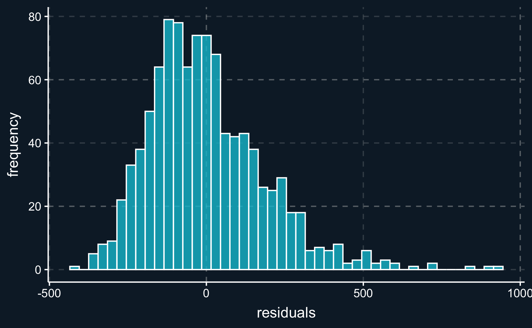
Looking at the spread of residuals (\(\widehat{u}_i = y_i - \widehat{y}_i\)) we want them to be spread evenly around zero.
# Plot histogram of residuals
ggplot(tibble(res = lm_all$residuals), aes(x = res)) +
  geom_histogram(color="white", alpha = 0.8, binwidth = 30) +
  labs(x = "residuals", y = "frequency")
We can see that the residuals are in fact almost normally distributed.
After having analyzed the residuals and our assumptions we can take a look at a measure indicating the so called goodness-of-fit, namely \(R^2\). It measures how much of the variance of the dependent variable can be explained by the independent variables. Formally:
\[ R^2 = \frac{\text{Explained variatoin}}{\text{Total variation}} \]
Conveniently, \(R^2\) is always between \(0\) and \(1\) and a higher value indicates a better model fit. However, you have to treat the values with caution. Sometimes a very high \(R^2\) can even point to a biased model while a model with a low \(R^2\) can provide an adequate fit. For example, in some discipline of sciences involving human behavior like social sciences, there is inherently a greater amount of unexplained variation. Opposed to that, physical or chemical process might be easier to predict. The size of \(R^2\) does also not change the interpretation of the regression coefficients.
A problem with \(R^2\) is that it always increases as more independent variables are included - even if they are random and have no effect at all. To correct for that behavior, it is advisable to use the \(\text{Adjusted} \, R^2\). It includes a term for the number of independent variables used.
\[ \text{Adjusted} \, R^2 = 1 - \frac{(1-R^2)(n-1)}{n-p-1} \,, \]
where \(n\) is the sample size and \(p\) the number of independent variables. This way, you can compare models and account for their scarcity.
Let’s build a second regression model, where we only include variables that were statistically significant in the previous model.
# Include only significant regressors
lm_imp <- lm(expected_cost ~ age + bmi + smoking, data = df)
summary(lm_imp)
Call:
lm(formula = expected_cost ~ age + bmi + smoking, data = df)

Residuals:
   Min     1Q Median     3Q    Max
-481.5 -138.9  -27.2  112.5  931.2

Coefficients:
            Estimate Std. Error t value Pr(>|t|)
(Intercept)  392.959     27.560   14.26   <2e-16 ***
age            7.198      0.478   15.05   <2e-16 ***
bmi           -2.071      0.824   -2.51    0.012 *
smoking      198.401     14.283   13.89   <2e-16 ***
---
Signif. codes:  0 '***' 0.001 '**' 0.01 '*' 0.05 '.' 0.1 ' ' 1

Residual standard error: 201 on 996 degrees of freedom
Multiple R-squared:  0.296, Adjusted R-squared:  0.294
F-statistic:  140 on 3 and 996 DF,  p-value: <2e-16
Except for \(bmi\), coefficients are very similar. We’ll look into that in just a second. But first let us compare both models with regard to \(\text{(Adjusted)} \, R^2\).
[1] "Adjusted R^2: 0.40"[1] "Adjusted R^2: 0.29"Other metrics used to select the best model out of a class of models tackling the same problem (with the same data) are Akaike’s Information Criteria \(AIC\) and Bayesian Information Criteria \(BIC\). Both \(AIC\) and \(BIC\) penalize the inclusion of additional parameters. The exact computation we will disregard for now.
[1] "AIC: 13294.02"[1] "AIC: 13447.79"For both \(AIC\) and \(BIC\), the model with the lowest value is preferred.
In many applications, it is not advisable to include all potential independent variables but to go through steps of theoretical consideration and model selection to find the best model. Throughout the course we wills stress the importance of theoretical knowledge to build valid models that allow to draw the right conclusion.
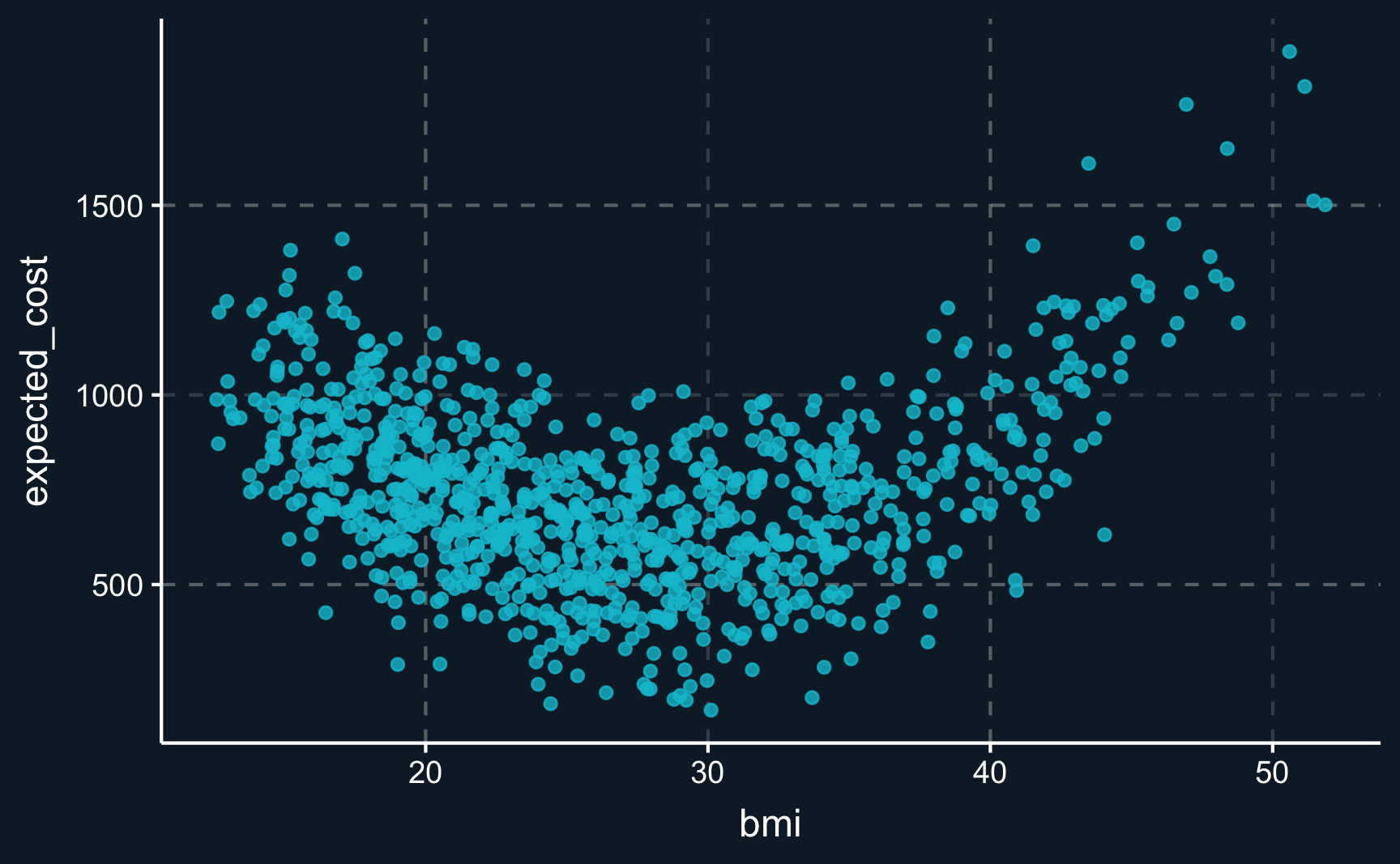
For example, is it correct to assume a linear relationship between \(bmi\) and the outcome \(expected\_cost\)? One could say, that a health insurance expects higher costs for individuals with a very low and a very high BMI. We can plot both variables and see whether the graph indicates some form of non-linearity.
And actually (not surprisingly, because we simulated the data ourselves), there is a non-linear relationship between the variables. As hypothesized, individuals with a low and a high BMI are expected to be more costly. However, this analysis disregards all other variables and should be just an indication. We still need to model this indicated relationship in our model.
# Plot relationship between BMI and expected cost
ggplot(df, aes(x = bmi, y = expected_cost)) +
  geom_point(alpha = 0.8)
But can we include non-linear terms in our linear regression? In its name, there is the term “linear”, so what can we do about it?
In fact, it is quite simple to include non-linear terms into the regression equation. When the relationship is assumed to be like depicted in the graph above, a squared term is usually included, i.e. \(bmi^2\).
# Include quadratic term for BMI
lm_sq <- lm(expected_cost ~ age + bmi + I(bmi^2) + smoking, data = df)
summary(lm_sq)
Call:
lm(formula = expected_cost ~ age + bmi + I(bmi^2) + smoking,
    data = df)

Residuals:
   Min     1Q Median     3Q    Max
-389.6  -80.3   -2.6   90.2  350.2

Coefficients:
             Estimate Std. Error t value Pr(>|t|)
(Intercept) 1964.4792    41.7901    47.0   <2e-16 ***
age            7.8004     0.2919    26.7   <2e-16 ***
bmi         -122.6122     2.9778   -41.2   <2e-16 ***
I(bmi^2)       2.0803     0.0507    41.1   <2e-16 ***
smoking      184.4309     8.7113    21.2   <2e-16 ***
---
Signif. codes:  0 '***' 0.001 '**' 0.01 '*' 0.05 '.' 0.1 ' ' 1

Residual standard error: 122 on 995 degrees of freedom
Multiple R-squared:  0.739, Adjusted R-squared:  0.738
F-statistic:  704 on 4 and 995 DF,  p-value: <2e-16
From the summary, we can see that including the square term significantly improves the model fit. Check for yourself the metrics \(R^2\) and \(AIC\) and plot the histogram of residuals.
You should now have seen, that it is extremely important to rely on theoretical considerations when building models.
The following assumptions must be fulfilled for a linear regression to deliver valid results.
Linearity: Relationship between \(X\) and \(Y\) is linear.
Homoscedasticity: Variance of residual is the same for any value of \(X\).
Independence: Observations are independent of each other. Residuals are independent of each other.
Normality: For any fixed value of \(X\), \(Y\) is normally distributed. Residuals of the model are normally distributed.
Assignment
In the data folder you find a data set car_prices.rds. It is slightly modified of the data set you could also find on Kaggle, the largest data science community worldwide hosting published code and data for a whole variety of applications. Check it out if you are interested!
Again, open a new .R script/file and name it 02_reg.R. Then, you should accomplish the following tasks.
You can copy parts of the code from the example. Also keep in mind, that not all functions are built in base R but you might have to load a package.
Read the data and check the dimensions. How many rows and how many columns does the data have? You could use e.g. the
dim()command.Use appropriate commands to get a more detailed look at the data. What data types do you see? How do numbers differ from strings regarding their data type?
Run a linear regression. You want to explain what factors are relevant for the pricing of a car.
-
Choose one regressor and
explain what data type it is and what values it can take on
what effect is has on the price and what changing the value would have as a result
whether its effect is statistically significant.
Add a variable
seat_heatingto the data and assign a valueTRUEfor all observations. You can use e.g.df %>% mutate(new_variable = value). Assign it to a new object and run a regression. What coefficient do you get for the new variableseat_heatingand how can you explain it?
Please see here how you have to successfully submit your solutions. I would recommend you to solve the assignments first in .R scripts and in the end convert them to the required format as explained in the submission instructions.
